
This article will familiarize you with the overview, and configuration of the Dual Axis Bar Line Graph.
|
Skip Ahead to: |
Overview
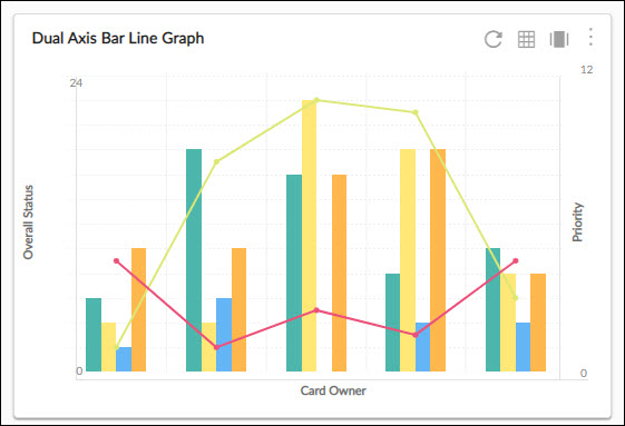
A dual-axis bar line graph shares a horizontal axis (time) across two chart types: the bar chart and line chart. It is useful when the variables plotted with each chart type are related, but are on different numeric scales.
Configuration
To plot chart, perform the following steps –
1. Open the Analytics page and click the Add Widget icon. The Analytics Builder appears.
2. Click the Dual Axis Bar Line Graph. The Settings page appears.
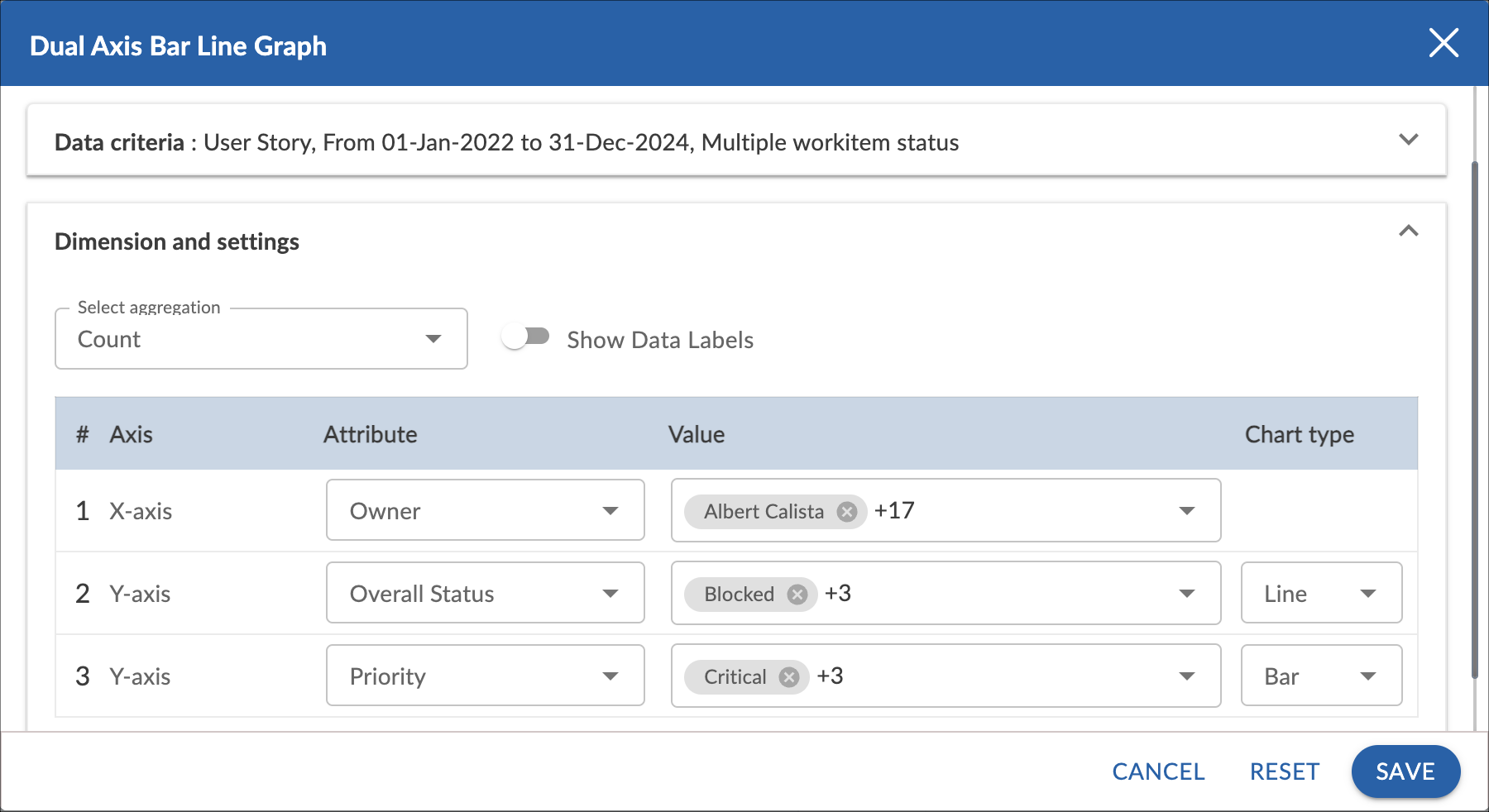
3. Enter the given information in the Data Criteria and Dimension and Settings as per your requirements.
- Widget Name – Modify the widget name if required.
Data Criteria
- Select Workitem type – Select the workitem type for which you want to plot the chart. You can select any number of workitems for a scatter chart. If the selected workitem type has no instances in it, a message is displayed on the screen.
Note: If you select the My Workitem option, the Release, Sprint, and Task Plan options won’t be selected as they are dependent on the form’s execution. - Select workitem status – Select the workitem status such as All, Open, Closed, etc. for the workitem types.
- Select Filter – Select the filter that you want to apply on the workitems for the scatter chart. You can also create a new filter.
- Date Range – The Date Range section provides flexible options for selecting date-based criteria and ranges:
- Select Date Criteria: Use the dropdown menu to choose how data is fetched. Options include Created on, Closed on, and Last modified on.
- Select Date Range: Choose dynamic or custom date ranges to automatically display data based on the selected period. The options include – Custom dates ( Requires additional selection of Start Date and End Date), Current month, Current quarter, Current week, Current year and many more.
- If “Custom dates” is selected, two additional dropdowns will appear to specify the Start Date and End Date.
Note: For Organization Analytics and Personal Analytics, the Date Range section will only display Start Date and End Date options.
Dimensions and Settings
- Select aggregation – You can plot the chart based on the numeric field of the selected workitem type such as count, sum, percentage, etc.
- Show Data Labels – Enable this option to view the data labels/values on the chart.
Select Axis on the chart
- X Axis – Select the attribute (and its values) which you want to be plotted on the X axis of the chart. The attribute field shows all the fields which are common in the selected workitem types.
- Y Axis (Line chart)- Select the attribute (and its values) which you want to be plotted on the Y axis of the Line chart.
- Y Axis (Bar chart) – Select the attribute (and its values) which you want to be plotted on the Y axis of the Bar chart.