
Start with the video first to get a better grasp of the topic!
|
Skip Ahead to: |
Overview
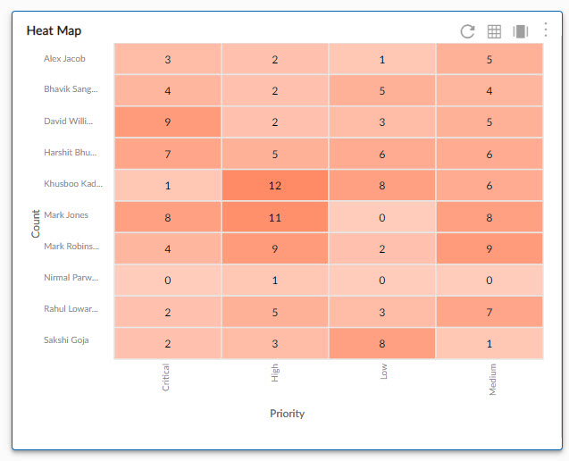
Heatmap is a representation of the item count in which the data values are represented in multiple shades of color. The darkest shade of the color is the highest value while the lightest shade of the same color is the lowest value.
The Heatmap is available for the following analytics components – Pivot Table, Analytics Builder, Defect Status widget
Configuration
To plot a Heatmap, perform the following steps:
1. Open the Analytics page and click the Add Widget icon. The Analytics Builder appears.
2. Click the Heat Map chart. The Settings page appears.
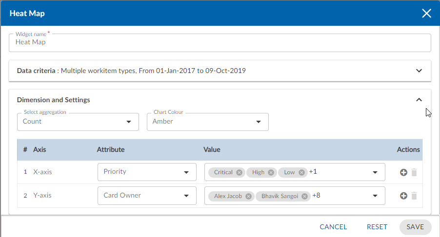
3. Enter the given information in the Data Criteria and Dimension and Settings as per your requirements:
Data Criteria
- Modify the widget name, if required.
- Workitem type – Select the required workitem types for which you want to plot the chart. A message is displayed on the screen if the selected workitem type has no data in it.
Note: If you select the My Workitem option, the Release, Sprint, and Task Plan options won’t be selected as they are dependent on the form’s execution. - Select workitem status – Select the workitem status such as All, Open, Closed, etc. for the workitem types.
- Create filter – You can create custom List views for viewing specific workitem groups using the Advanced Filter option. Create a filter where you can set a combination of filter criteria and then apply them.
- Date Range – The Date Range section provides flexible options for selecting date-based criteria and ranges:
- Select Date Criteria: Use the dropdown menu to choose how data is fetched. Options include Created on, Closed on, and Last modified on.
- Select Date Range: Choose dynamic or custom date ranges to automatically display data based on the selected period. The options include – Custom dates ( Requires additional selection of Start Date and End Date), Current month, Current quarter, Current week, Current year and many more.
- If “Custom dates” is selected, two additional dropdowns will appear to specify the Start Date and End Date.
Note: For Organization Analytics and Personal Analytics, the Date Range section will only display Start Date and End Date options.
Dimension and Settings
- Select aggregation – You can plot the chart based on the numeric field of the selected workitem type such as count, sum, percentage etc.
- Chart Color – Select the color for your chart.
Select Axis on the chart
- X Axis – Select the attribute (and its values) which you want to be plotted on the X axis of the chart. The attribute field shows all the fields which are common in the selected workitem types.
- Y Axis – Select the attribute (and its values) which you want to be plotted on the Y axis of the chart.
4. Click SAVE. The Heat Map chart will be rendered as per the set metrics.