
Cycle Time represents the total time taken for a task (bug or feature) to be completed, from when it was prioritized and pushed to the board. Lead and Cycle Time charts display the average time it takes to process a task from the start to finish point. These charts help analyze task flow and identify areas for performance improvements. Project managers should keep Lead and Cycle times low, as they reflect sunk investment costs with no immediate business benefits.
Cycle Time is an element the team can influence by optimizing its work process. It serves as a mechanical measure of process capability. Reducing cycle time can (and should) reduce lead times as well.
In SwiftKanban, you can view Cycle Time for cards passed through specific columns/stages as:
- Overall Average,
- Column-wise Average,
- Distribution of cards within Cycle Time ranges,
- Cards within and out of control limits.
By including the Backlog in the filter options, you can also generate Lead Time metrics such as Overall Average, Column-wise Lead Time Average, and more.
Cycle Time for a Card
In SwiftKanban, the Cycle Time for a card is recorded for each column, based on the time spent in a particular column—from the Start Date (when the card enters the column) to the Exit Date (when it exits).
-
Note: The time spent in a column is calculated as:
Exit Date – Entry Date (1 day = 24 hours from entry time).
The Total Cycle Time for a card is the sum of the time spent in all the columns it passed through.
Key Considerations for Cycle Time Calculation
By enabling the “Select the days that you want to consider as holiday(s)” Board policy is enabled under Board Behavior. Note: These considerations are for Cycle Time Average, Cycle Time Distribution, and Cycle Time Control.
-
Card Movement Consideration:
Only cards that have crossed the selected (any/one) columns in the given date range are considered for analysis. -
Time Capture for Selected Columns:
Time is captured only for the selected columns in the filter. Past movements are included, even if they do not fall within the selected date range. However, future movements are not considered. -
Exclusion of Archived Backlog Cards:
Cards that have been archived from the Backlog will not be considered in the Cycle Time analysis. -
Inclusion of Backlog Time for Multiple Lanes:
If all or multiple lanes are selected, Backlog Time will be included in the analysis.
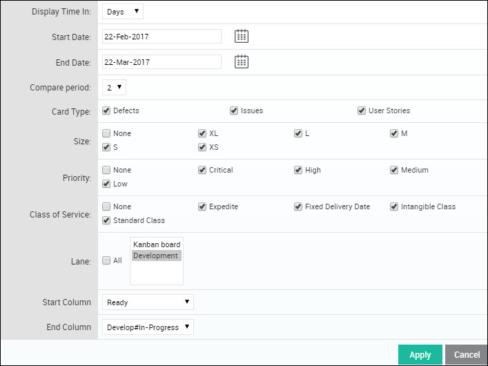
Cycle Time Analytics Filter
To filter the Cycle Time data, follow these steps:
-
Click the Filter icon on the side toolbar of the Cycle Time Analytics page.
-
Choose the relevant options in the filter pop-up and click Apply. The filters apply to all Cycle Time analysis charts, refreshing them accordingly.
Available Filters:
-
Display Time In: Select the unit of measurement (Hours, Days, or Weeks) for Cycle Time to be plotted on the Y-axis.
-
Start Date & End Date: Limit the scope of data based on the selected date range.
-
Time Period: Choose the time interval (Daily, Weekly, Monthly, Quarterly).
-
Note: For Weekly, the week runs from Sunday to Saturday.
-
-
Card Types: Select card types for filtering.
-
Lane: Select specific lanes for the analysis.
-
Start & End Column: Define the start and end columns for the Cycle Time chart.
Note:
-
The chart considers cards that have exited the End Column during the selected date range, or cards that may have skipped the Start Column and moved directly to the End Column.
-
Cycle Time is calculated based on the time a card spent in any column between the Start and End Columns, up until it was moved out of the End Column or reached the Done column.
If the End Column is tagged as Done, Cycle Time is calculated based on the card’s entry into the End Column (not its exit).
If multiple lanes are selected, the Cycle Time calculation includes archived cards and any cards that have entered or moved beyond the Done column.
Cycle Time Charts
Overall Average
The Cycle Time Overall Average chart displays the Cycle Time, Wait Time, Work Time, and Blocked Time in one view. It plots the average metrics for cards that have exited the End Column in the given filter criteria.
For example, if multiple cards exited the End Column on a specific date, the chart calculates the average Cycle Time as:
(Total Cycle Time of Card A + Card B + Card C) / No. of Cards.
You can also generate a Lead Time Average chart by selecting Backlog in the filter.
Time Metrics Breakdown
-
Cycle Time for a Card = Sum of time spent in each column the card passed through, including ‘Ready’, ‘In-Progress’, ‘Completed’, and Blocked Time.
-
Work Time:
The time spent in the ‘In-Progress’ columns, excluding any blocked time.
Work Time reflects the actual productive time a bug/feature is worked on and is used to analyze team productivity. -
Wait Time:
The time spent in the ‘Ready’ and ‘Completed’ columns, excluding blocked time.
Wait Time represents the time a card was idle, waiting to be pulled into the next working column. Analyzing Wait Time against Lead and Cycle Time ratios highlights opportunities for process improvement. -
Blocked Time: Blocked Time = Time the card was blocked in columns
Blocked Time measures the delays in progress, which can signal the need for team collaboration or escalation to resolve blockages quickly.
Thus, the Cycle Time for a card can be broken down as:
Cycle Time = Work Time (excluding blocked time) + Wait Time (excluding blocked time) + Blocked Time (in all columns).
For example, refer to the Tables 1 and 2 below:
Table 1: Card Movement Across columns
| Ready | Development | Approve | ||||
| Entry Date | Exit Date | Entry Date | Exit Date | Entry Date | Exit Date | |
| Card 1 | 1-Jan-14 | 3-Jan-14 | 3-Jan-14 | 5-Jan-14 | 5-Jan-14 | 6-Jan-14 |
| Card 2 | 2-Jan-14 | 3-Jan-14 | 3-Jan-14 | 6-Jan-14 | 6-Jan-14 | 7-Jan-14 |
Table 2: Overall Average Calculation
| Ready | Development | Approve | Work Time | Wait Time | Cycle Time | ||
| (Waiting Column Type) | (Work Column Type) | (Completed Column Type) | |||||
| Card 1 | 2d | 2d | 1d | 2d | 3d | 5d | |
| Card 2 | 1d | 3d | 1d | 3d | 2d | 5d | |
| Average | 1.5d | 2.5d | 1d | 2.5d | 2.5d | 5d |
The Overall Average chart plots the Average Work Time- as 2.5, the Average Wait Time as 2.5, and the Average Cycle Time as 5.
If cards are blocked, for example in the Development Column, tables 3, 4, and 5 below explain the revised calculation:
Table 3: Overall Average Calculation, where cards are blocked in a column
| Ready | Development | Blocked in Development Column | Approve | Work Time (excluding Blocked Time) | Wait Time | Blocked Time | Cycle Time | ||
|---|---|---|---|---|---|---|---|---|---|
| (Waiting Lane Type) | (Work Lane Type) | (Completed ColumnType) | |||||||
| Card 1 | 2d | 2d | 1d | 1d | 1d | 3d | 1d | 5d | |
| Card 2 | 1d | 3d | 0.5d | 1d | 2.5d | 2d | 0.5d | 5d | |
| Average | 1.5d | 2.5d | 0.75d | 1d | 1.75d | 2.5d | 0.75d | 5d |
Applying Filter
Select the filter options and generate the Overall Average chart.
Interpreting the Chart
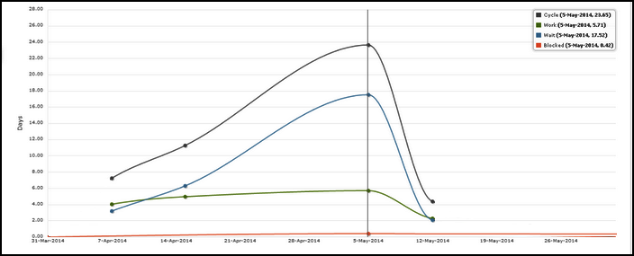
In the above image, the Average Cycle Time is 23.65 days for cards that passed through the ‘Ready For Deployment#Production’ column between 29th April to 5th May (cards may or may not have entered the ‘Ready for development ‘ column).
- If you select the last column on the board in the End Column, it plots the cards exited from the last column (the card may be pulled back, but it is considered in the chart).
Note: If the End column is tagged as a Done column type, then the cycle time is calculated till the card’s entry into the End column, not based on its exit from the End column.
-
End Column as “Done” Column Type:
If the End column is tagged as a Done column type, the Cycle Time is calculated based on the card’s entry into the End column, not its exit. This ensures the Cycle Time calculation reflects when the task was completed and entered the Done stage. -
Cycle Time Calculation for a Specific Column:
To calculate Cycle Time for a specific column, you can select the same column for both Start and End Columns in the filter.-
For cards that move back and forth between the Start and End columns, Cycle Time is calculated as the time difference between the latest Exit Date from the End column and the earliest Entry Date into the Start column.
-
-
Columns Created During Board Life Cycle:
If a column was added to the board after the board was created, the Cycle Time calculation will only consider the cards that have explicitly entered or exited that column. The column’s creation date is important here; data will only be shown for cards that passed through the column after it was created. -
Renamed Columns:
If a column was renamed during the board’s lifecycle, the Cycle Time calculation will include data for the column under its current name, but only if the column exists during the selected date range. -
Deleted Columns:
Deleted columns are excluded from Cycle Time calculations. If a card spent time in a deleted column, that time will not be counted, even if the column existed during the selected date range.
Table 4: More card movements covering different scenarios
| Ready | Development | Approve | Card Movement | ||||
| Entry Date | Exit Date | Entry Date | Exit Date | Entry Date | Exit Date | ||
| Card 1 | 1-Jan-14 | 3-Jan-14 | 3-Jan-14 | 5-Jan-14 | 5-Jan-14 | 6-Jan-14 | Passed all columns |
| Card 2 | 2-Jan-14 | 3-Jan-14 | 3-Jan-14 | 6-Jan-14 | 6-Jan-14 | 7-Jan-14 | Passed all columns |
| Card 3 | 9-Jan-14 | 11-Jan-14 | 11-Jan-14 | 12-Jan-14 | Skipped first column | ||
| Card 4 | 8-Jan-14 | 9-Jan-14 | 9-Jan-14 | 12-Jan-14 | Archived from the second column | ||
| Card 5 | 10-Jan-14 | 11-Jan-14 | 11-Jan-14 | 14-Jan-14 | Skipped column in between | ||
| Card 6 | 8-Jan-14 | 9-Jan-14 | 9-Jan-14 11-Jan-14 |
10-Jan-14 13-Jan-14 |
10-Jan-14 13-Jan-14 |
11-Jan-14 14-Jan-14 |
Repeated flow in through columns |
Table 5: Lane-wise Calculation for card movements covering different scenarios
| Ready | Development | Approve | Work Time | Wait Time | Cycle Time | ||
| (Waiting Column Type) | (Work Column Type) | (Completed Column Type) | |||||
| Card 1 | 2d | 2d | 1d | 2d | 3d | 5d | |
| Card 2 | 1d | 3d | 1d | 3d | 2d | 5d | |
| Card 3 | 2d | 1d | 2d | 1d | 3d | ||
| Card 4 | 1d | 3d | 3d | 1d | 4d | ||
| Card 5 | 1d | 3d | 4d | 4d | |||
| Card 6 | 1d | 3d | 2d | 3d | 3d | 6d |
Table 6: Average calculation considering different date ranges in the filter (w.r.t. card movement in Table 5)
Cycle Time Column-wise Average
The Column-wise Average Chart provides a comparative trend of Cycle Time for each column over time. It shows the average cycle time for cards that passed through each column, including those that exited the End column or moved beyond the Done column.
You can select a previous period for comparison to see how the cycle time has evolved. This chart gives a clear snapshot of which columns are showing improvement (reduced cycle time) and which are degrading (increased cycle time), helping you quickly identify areas that may need attention, such as process changes or resource reallocation.
Note: The Cycle Time Column-wise Average chart reflects the average cycle time for cards that passed through each selected column. If the “Select the days that you want to consider as holiday(s)” board policy is enabled, any days marked as holidays will be excluded from the cycle time calculations for the columns. This ensures that holidays do not distort the cycle time analysis, providing more accurate insights into your workflow performance.
Applying Filter
In the filter, select the Start Date and End date to plot a chart that displays the same duration in Comparison trends. Select the Compare Period value so that the trends will appear for that number of periods.
Select other filter options, as required, and apply. If you select ‘All’ in the Lane option, the chart is displayed for all Lanes and you can expand and collapse to view the chart for a specific Lane. If you select the ‘All’ option, the chart considers all cards that exited the last column or have moved beyond the Done column type of each lane.
Interpreting the Chart
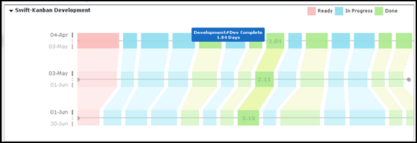
The duration in the above example is 30 days, hence the previous three periods (based on the Compare Period value) of 30 days are shown. Click anywhere on a column for which you want to view the Cycle Time. The trend is highlighted and the cycle time value appears for each period.
The legend indicates the color code for each Column type i.e. Ready, In-Progress, and Done.
Click the Expand/Collapse icons next to the Lane name to view the chart for the required Lane.
From the above image, you can see how the Cycle Time has reduced over a period of time from 3.19 days to 1.04 days, indicating an increase in team productivity.
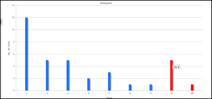
Cycle Time Distribution
The Cycle Time Distribution Chart is a histogram that displays the frequency distribution of cards based on the average of a selected metric, such as Cycle Time, Work Time, Wait Time, Blocked Time, or Lead Time. For example, when you select Cycle Time Distribution, the chart shows the count of cards that fall within specific Cycle Time ranges.
Similarly, you can view the Work Time Distribution chart, which shows the frequency distribution based on the Work Time of cards.
This chart helps identify troubled cards or exceptions. Cards that fall beyond the Upper Control Limit (UCL) are highlighted in red bars, indicating that they are outside the expected range, signaling potential issues that may require attention. Check out the UCL calculation in the Cycle Time Control Chart section.
Applying Filter
Select the filter options, as required, and apply.
-
Select the Metric:
You can choose from Cycle Time, Work Time, Wait Time, or Blocked Time to view the distribution. To generate a Lead Time Distribution chart, select Backlog in the Start Lane. -
Plot Chart Based on Metric:
Based on the selection in the ‘Plot Chart By’ filter, the chart will plot either the count or percentage of cards, grouped by the nearest metric value (e.g., Cycle Time). You can also refer to the calculations for how the average metric is computed. -
Narrow Down by Filters:
You can apply additional filters, such as Card Type, Priority, etc., to focus on specific exceptions and identify trends or outliers. -
Visualize Percentiles:
The histogram allows you to visualize percentiles, helping you understand the frequency of cards being completed, blocked, or worked upon based on specific percentile values. Enter percentile values (comma-separated) in the Confidence Interval field to see vertical dotted lines demarcating the values below which the average Cycle Time or Wait Time data falls. This helps highlight areas where performance may need attention.
Interpreting the Chart
The frequency ranges are generated based on the actual Analytics (for example, average Cycle Time in the Cycle Time Distribution chart) rounded off to the nearest digit.
The height of the bars represents the count of cards/% of cards. On hovering over a bar, the tooltip displays the metric value and the count of cards / % of cards.
The red bar indicates outliers in the range i.e. cards that are beyond the UCL of the metric value. If there are multiple numbers of cards or the % is high, your process needs a change.
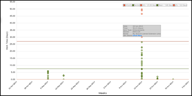
Cycle Time Control
The chart plots points indicating cards that have metrics above or below average and beyond control limits. The chart can be plotted to track various metrics for cards – Cycle Time, Wait Time, Work Time, or Blocked Time. The cards should have exited from the End column or moved to the End column if it is a Done column type and during the date range selected.
Applying Filter
Select the filter options, as required. Along with other filter criteria, you can also select the Metric you want to view, such as Cycle Time, Work Time, Wait Time, and Blocked Time. To know more about these metrics, read here.
To view the chart for the Lead Time, select Backlog in the Start Lane and the End Lane as you want. You can view the chart for each Lane or All Lanes. If you select the ‘All’ option, the chart considers all cards that exited the last lane.
On applying the filter, the graph displays the legend in the left corner. The green line indicates the mean or average time for the selected period. The red line above the green line is the Upper Control Limit (UCL) and the one below the green line is the Lower Control Limit (LCL). See the control limit calculation here.
Interpreting the Chart
The cards falling within the range of UCL and LCL are indicated by green dots. The red dots above the UCL and below the LCL indicate the metric for the item is beyond the control limit. There may be special cases for such cards. But several points outside these control limits are signals that the process is not operating as consistently as possible, and needs a change.
To find out the card that is out of control limits, rest your pointer on the outlier, you can see the card name and the metric. Click the ‘Click here’ link to view the card details.
Control Limit Calculation
As a definition, control limits statistically indicate whether any process is under control and stable. The upper control limit (UCL) and lower control limit (LCL) are calculated statistically from the cards’ data that are extracted as per the filter criteria applied to the analytics.
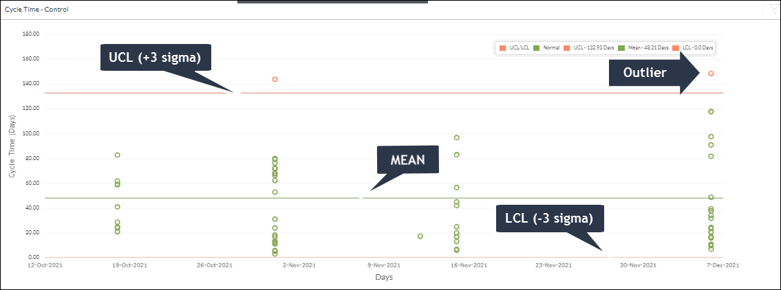
Once the mean(total time value of cards/count of cards) is calculated and the central line is drawn accordingly, the Control limits are defined with the standard deviation with an area of +/- 3 sigmas on either side of the central line. UCL is drawn above the central line and called as +3 sigma line. LCL is drawn below the central line and called a -3 sigma line. If the dots representing individual cards fall within the standard deviation of the mean, then the process is considered to be in control. Any dots beyond the UCL or LCL are considered outliers and require a thorough analysis.