In this article, we will help you understand the Predicted date widget.
|
Skip Ahead to: Forecasting capability of the Predicted Date of Completion Widget |
Overview
The Predicted Date Widget provides a visual depiction of how and in what quantity workitems/cards are getting added to the scope and also getting completed. This helps you track the performance of the card and how close you are to completing the cards as a whole. The widget provides a predicted end date to complete pending items based on the current progress. It also provides the required throughput based on the current date and the number of days remaining as per the planned end date. So, by observing this widget, you get clear visibility of any scope and timeline slippage.
Visualizing the Widget
Select the Card Types or Delivery Cadence in the filter panel at the top. Next, as per the selection of an instance, the predicted date widget gets generated.
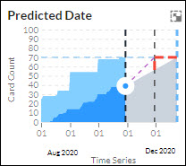
- Minimized view of Predicted Date
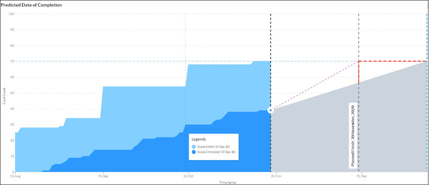
- Maximized view of Predicted Date of Completion
On the Predicted Date diagram, you can find information about the status of work on a particular day/month: For Scope added, the cards in the Ready column will be considered and for Scope Done it will be cards on the Done column type. Hover and rest your pointer on a vertical grid line to see the distribution of count of cards added in scope plotted on Y-axis and scope completed at a particular moment in the timeline plotted on X-axis. On the y-axis, the cumulative count of cards is displayed i.e. all the cards created in the hierarchy from the card creation date or card identified date.
Based on the overall pattern, you can also interpret what is the pace of progress; if the light blue section remains the same and the dark blue section grows exponentially, then it should be OK. In the below image on 30th September, the ‘Scope Added’ count is showing 24 from 01 September to 30th September. As you proceed to the next dates, you can see that the cards in the column have increased steadily indicating progress. When the scope added remains much more than the scope completed, the band widens. In this situation, one should intervene and find out the reason behind it. It might be too many cards getting added continuously in the Ready column, or fewer cards are getting DONE or the cards are taking much time after they move to the In-progress column type and before they are getting Done.
The chart can also help you spot all sorts of issues that a team may be facing: where the bottlenecks are in the workflow, is work backing up at a particular status? If so, there is a bottleneck downstream of that status. This is where the Predicted Date of Completion widget shows its real value. You can decide to take no tasks further in the column, limit your cards in progress, avoid task-switching, or identify any bottlenecks.
Forecasting capability of the Predicted Date of Completion Widget
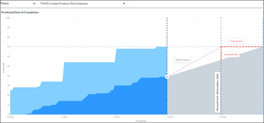
The Required Velocity dotted line helps you visualize the trend line of throughput required to complete the pending tasks in the future based on the current velocity. The red dotted area shows the spillover scope of work along with the time spillover. The last light blue dotted line predicts the end date when the pending cards can be completed given the current throughput.
Note: The prediction is done only if the selected parent card is at least 25% completed. If the completion of the parent card is less than 25%, then the prediction is not done. For example, in the given screen, the completion percentage of the Theme is more than 25%, so the prediction for its child cards (user stories) is done.
- Using the information provided in the impact matrix section, you can either remove the number of cards shown beside the spillover field to get the work completed as per the planned end date.
- You can even increase the velocity as per the value shown beside the required velocity field to get the work completed as per the planned end date; else change the planned end date to the predicted end date.


