Overview
Kanban Board is the central place to execute your work based on your workflow, where your work is visible as it flows while limiting work-in-progress. The SwiftKanban Board is a powerful and flexible real-time Kanban Board for executing projects based on visual management. It is designed such that it gives you visual cues to identify the priority, the status of work, and bottlenecks, to help you get work done quickly and efficiently.
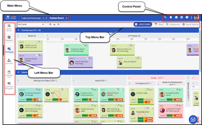
Example of a Kanban Board.
The SwiftKanban Board provides all the required flexibility to customize it to suit your value stream with so much less complexity and which is reflected in a few minutes.
To view the Kanban Board, go to the control panel and click My Boards menu The List of Boards view displays the Boards that you created as a product owner or Boards on which you are a team member. Double-click the board row to open the Board. The Kanban Board is displayed by default. Next time you log on to the application, the Kanban board you accessed last will appear by default. Alternatively, you can open the Kanban Board from the Recent Boards icon located on the top for quick access.
Visual Indicators on the Kanban Board
Let’s look at a default Kanban Board.
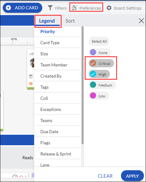
- Color Coding: The Kanban Board implements color code to identify the card types-User Story, Defect, Issue, etc. The card type is mentioned on the top bar of the card and also displays the color of the card. (click the Legend option under Preferences on the top menu bar, which displays the card color).
- Column in the Workflow: The columns represent the workflow-Ready, Develop, Validate, and Approve. A column is further divided into sub-columns i.e. In-Progress and Done, except the Ready and the Approve lanes.
- Lane/Board/Card Type Policies: The description you add (which can describe the policies for card movement) when you configure the Board/lanes show on hovering over the Board/Lane headers. The description or policies entered when you define a card type in the application, are shown by hovering on the card type in the Legend. This can be effective to communicate card movement policies on the board.
- Card Owner: The card on the Kanban Board displays the current owner by hovering on the Profile image or “Avatar”. If you have uploaded your picture to your profile, the avatar will be also used for identification. You can also select multiple owners for a card from the list of available users by simply adding a checkmark on the checkboxes beside the card owners to assign a card. In the case of multiple owners, the profile picture changes to multiple people image, and on mouse-hover displays the names of all owners.
- Priority: The three stars in different color combinations indicate the priority of a card. See Card Anatomy to understand the interpretation of the combinations.
- WIP Limit: The WIP limit set for a lane and the total number of cards in that lane is displayed on the lane header. For example, 5/3 indicates there are five cards in the lane and the WIP limit for the lane is three. As the total count of cards in the lane has exceeded the WIP limit i.e. the WIP limit is violated, the lane header is highlighted in red.
- Notifications/Inbox Count: When an item is assigned to you, the Home icon flashes a count to indicate the new item. The Notifications icon flashes the count when an event has occurred on the board i.e. when a team member has commented on a card or violated the WIP limit. The board when refreshed, increments the Inbox/Notifications Count if the Items/events are Unread. This is a very important visual indicator for a distributed team to get in sync.
- Instant Notification Pop-ups: Instant Notification Pop-ups inform about board activities such as adding a card, commenting on a card, etc. in which you are one of the card owners. Instant Notifications pop up at the bottom right corner on the event occurring, whether you are within SwiftKanban, or whenever you return to it if you have been working on other applications. The count of such notifications is also available on the Notifications widget, from which you can later track and navigate to the card to check the updates.
- Card Highlighting: On hovering over the card, it has an upturned corner at the bottom-right corner and a ‘shadow effect’ for a real ‘sticky note’ feel. This can be useful when you want to highlight the card when discussing an information radiator. Also, check the Legend option for more highlighting features.
- Flagged Cards: SwiftKanban enables you to flag a card, and mark it for different purposes – so that you can highlight different aspects of the card or draw attention to it. Depending on the reason for highlighting, you can select one or more types of flags to highlight the card. For more details please refer to Flagging a card.
- Card Aging: It is a horizontal line based on the thresholds and highlights the current status of the cards as per the value set by you. To know more about setting the threshold value, see this information.
Have a quick look at the Card Anatomy to understand how much information a card can provide on the SwiftKanban Board.
Board Settings: SwiftKanban provides a highly configurable Kanban Board designer using which you can map your value streams in terms of lanes and columns of the board, define WIP limits for columns, and track your work entirely using various features available on the Kanban board. See Managing the Board Settings to learn about all the Board-level settings that you can define in Kanban Board.
Left Menu Bar: You can perform various operations on the Kanban Board using the left menu bar. This toolbar holds different icons, which give you various options like Board Activity, Playback, Card Aging, Calendar View, and Card Type % Progress.
Top Menu Bar: You can perform various operations on the Kanban Board using the top menu bar. This toolbar holds different options like viewing all cards or your cards, zoom in on our option, Add Card, filter boards, legend, and sorting under Preferences, and Board Settings.
SwiftKanban provides the best of the features for:
Managing Work
- Add a Card
- Add a Custom Card Type to the Board
- Pull Cards from the Backlog Board
- Pull Cards from the Archived Cards
- Move Cards to Another Column
- Move a Card to the Backlog
- Archive one or more Cards
- View Archived Cards
- Transfer Card to a Different Board
- Flag a Card
- Change the Current Owner / Assign Multiple Owners
- Manage To-Dos for a Card
- Edit Card Details
- Add Code Snippet
- View/Update Custom Fields in a Card
- Clone/Duplicate a Card
- Abort Card
- Convert Card / Change Card Type
- Delete a Card
- Bulk Delete Cards
- Track Card Activity Log
- Track Card Movement History and Analytics
- View Card Links
- Copying Card URL
- View Card Type % Progress
- Subscribe Card
- View the Unique Business Id of a Card
Note: A card of a closed Board cannot be moved to any other lane of the same Board or transferred to any other Board. Moreover, you cannot transfer a card from an active Board to a closed Board. The closed Board will not even be displayed in the available Boards to transfer.
Tracking the Kanban Board
- View All Cards or My Cards/ToDos
- Refresh the Board
- View the Activity Log for the Kanban Board
- Apply Filters to View Specific Cards
- Publish Filter to the Users
- Filter by Cycle Time Threshold
- View Cards as per your Preference
- Tag your Cards
- View Board Calendar
- View Board Playback
Customizing the Kanban Board View
- Resize Columns
- Expand and Collapse Lanes
- Expand and Collapse Columns
- Zoom in and Zoom Out the Board
- Read-only view of the Kanban board
- Resize / Reposition Card Pop-up
Add a Card
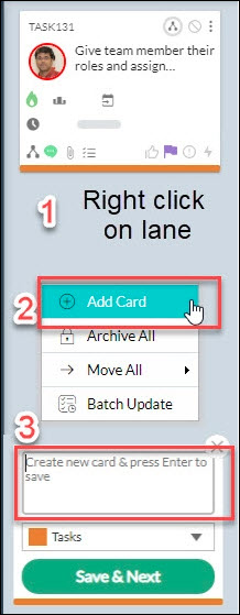
Add a card on the board to indicate tasks, and then move it to the next column as you complete your part of the work. To quickly add a card, right-click anywhere in the column (i.e. lane that indicates the current state of the workitem) to which you want to add. Select Add Card in the shortcut menu. In the card placeholder, select the card type and then type a card title, and press ENTER.
Note: While adding a card via right-click, it does not prompt for mandatory fields, if any. Later, when you open the card in the edit view and update it, you will be prompted to fill in those mandatory fields to save the update. The interface of the Card Modal window is simple yet intuitive. You get to view all the card attributes at a glance.
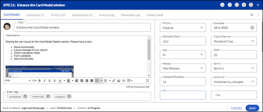
The card appears in the lane with the card carousel showing default values for mandatory card attributes such as Priority, Class of Service, and Size. Click the card title to edit values and add other details. Type the description of the card in a maximum of up to 60000 characters. You can use the formatting toolbar for text editing that provides basic features, including adding URLs and inserting images. Provide values for card attributes such as Due Date, Estimate, and so on. The estimate can be entered for a Card in days/hours/story points (as selected in preference). You can use this estimate to track the progress of deliverables in a CFD and Throughput chart.
To assign different card owners, click the Avatar box showing name and profile, and select the team members that you want to assign to that card by selecting them. You can select all the users in one go by clicking the Select All option. You can also select the lane to which you want to add the card. You can even select Backlog to add the card to the backlog if you do not want to work on it currently. If you miss selecting a lane when adding a card, the card will be added to the first lane on the board by default. You can change it later if you need to.
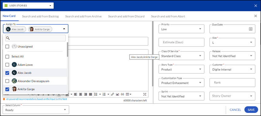
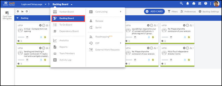
You can also add cards by navigating to the Main Menu » Backlog Board, or Main Menu » Card Listing » All Cards. From these views, you can add cards, edit, or delete the cards. You can filter and sort the list of cards to view, edit, or delete specific cards.
Add a Custom Card Type to the Board
The Issue, User Story, and Defect are the card types available on the SwiftKanban board. You can enable the custom card types for your board. See Define Card Types where an organization can create card types based on their requirement.
Once a Card Type is enabled, it appears in the Card Types palette on the Add card window at the bottom. Click the required Card Type, enter details, and then click the Save icon on the toolbar.
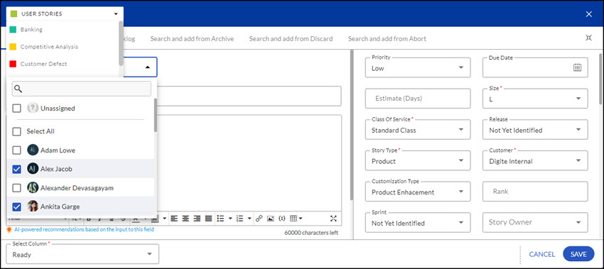
If you have already defined a backlog (created a user story, defect, or issue), you can pull the cards from the backlog and push them to the board.
Add Cards from the Backlog Board
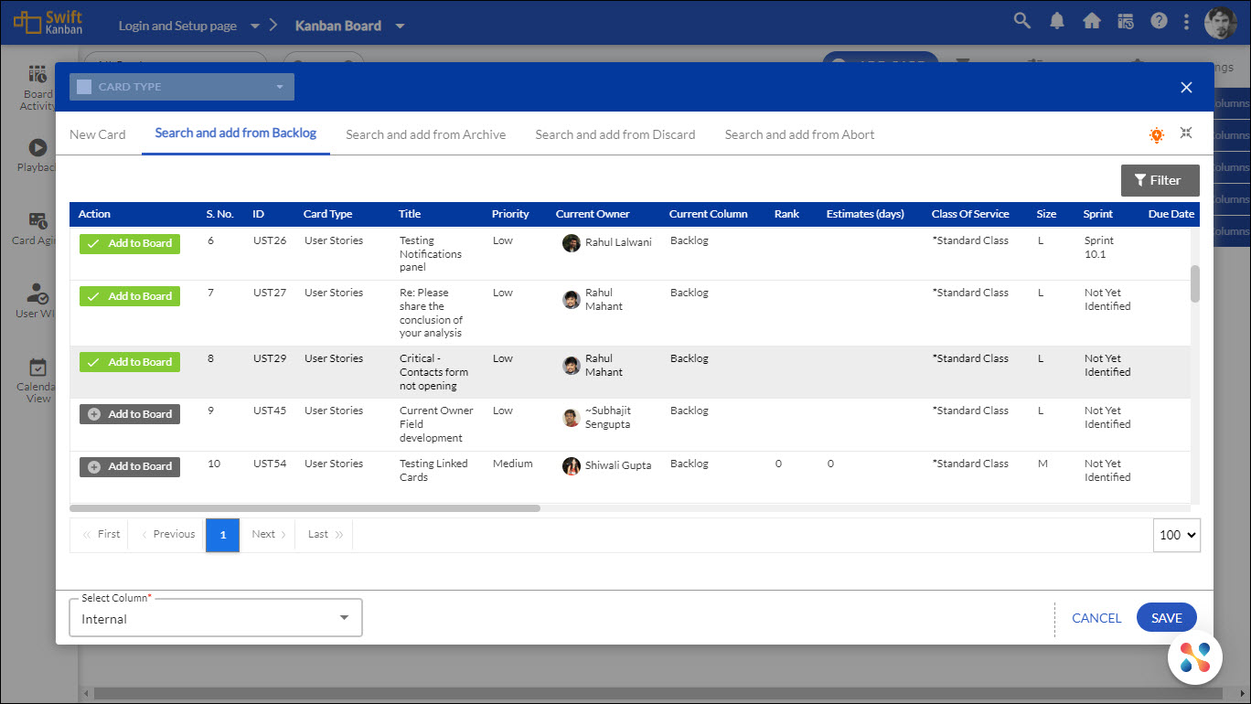
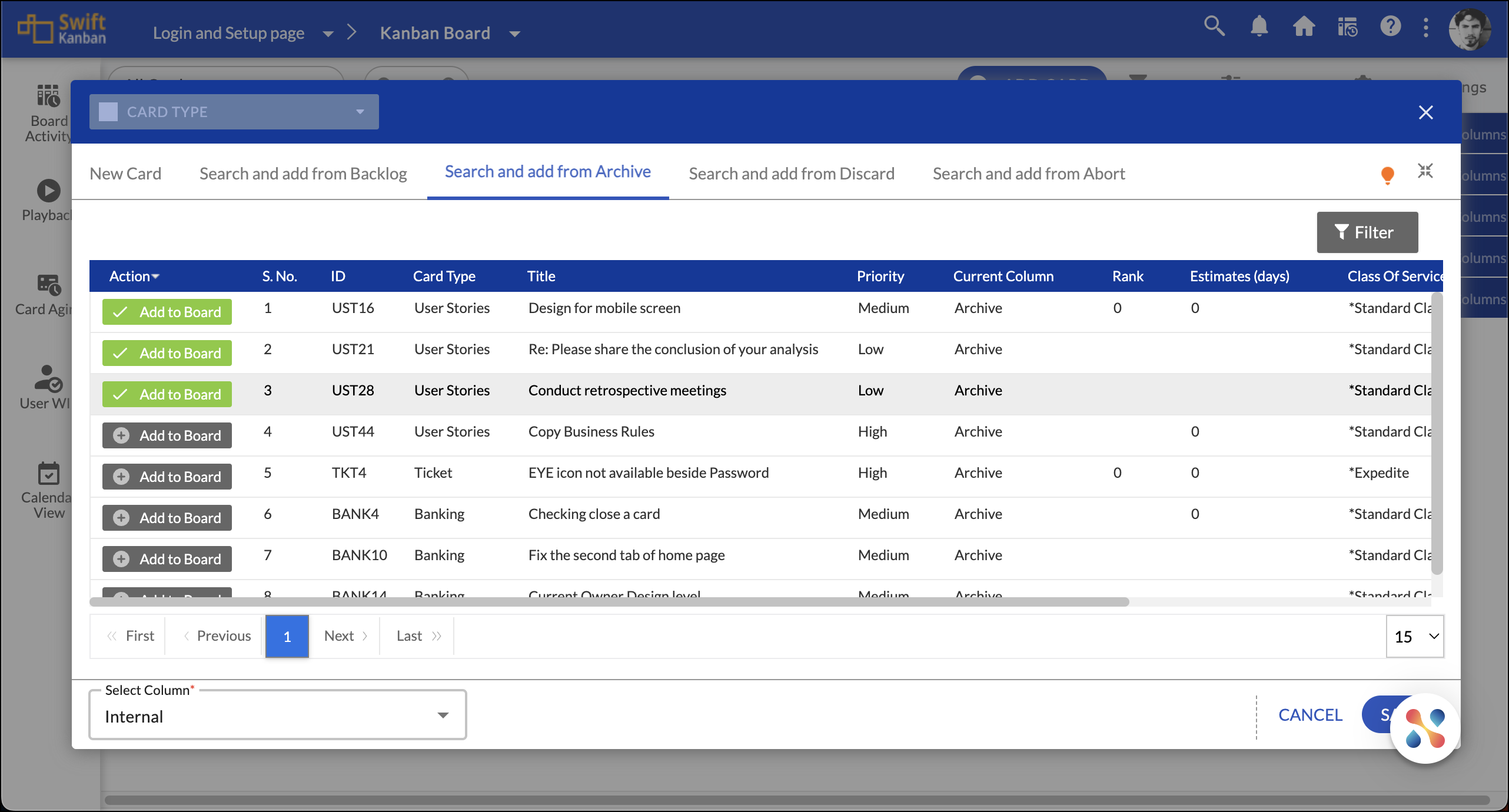
To pull a card or multiple cards from the backlog, click the ADD CARD button on the top menu bar. Select Search and Add from Backlog and click the Add to Board button for the cards you want to add to your Kanban Board. Select the column from Select Column that you want to add the card and click the Save button.
Note: The Select Column option will not be available if your Board has smart lanes. By default, the selected cards will be moved to the first column of the first swim lane on your Kanban Board i.e. Ready column.
To filter the list of items in the backlog based on Priority, Class Of Service, or size, click the required button in the top row and select one or more attributes from the drop-down list. To filter the list based on Id, rank, title, etc. enter the required details in the blank cells in the top row. Now, for the item, you want to pull, click the Add to Board button in the first column. By default, the card is pulled to the first column i.e. “Ready” on the board.
Note that If you have defined lanes on the board, you should select the first column in the Lane that shows up below. The card attribute-enabled lane displays the lane based on the attribute value of the card. For example, if the card is tagged ‘Critical’, only the Critical lane name is displayed. For custom label-enabled lanes, you can select from any one of the lanes.
Push a Card from the Backlog Board to the Kanban Board
SwiftKanban provides a separate Backlog Board, where you can view your backlog in the form of cards and push them to the board quickly. You can view the card details up front as on the board and decide which cards to push to the board.
Select the Backlog Board menu available in the Main menu bar. The cards, if added as Backlog from the Backlog view or Card Type List View are shown here. Click the Add to Board icon to push the card to the board, which appears on the mouse-over on the card. Card Menu is also available for the cards on mouse-over, enabling collaboration and card-related actions on the Backlog Board. If required, add cards to the Backlog Board by clicking the ADD CARD button on the top menu bar. It works similarly to the Kanban board Add Card feature. You will find other important board features on the Side toolbar to focus and prioritize cards- Board Filter, Legend, and Card Sizing Views.
The Backlog Board can be organized more effectively based on card attributes to help you quickly locate and push cards with specific attribute values. Moreover, the category lanes. resets the attribute value of the card when you move it to another category lane.
The Backlog Board also provides flexibility to organize the board by creating your backlog category lanes. As the prioritization can keep changing based on the dynamic business need, the categorization may need to change.
To organize your backlog based on card attributes or custom categories:
1. In the Backlog Board view, click the Backlog Settings icon on the top menu bar.
2. Click the Enable Organization button.
3. Select any one of the options from the following:
a. Select the ‘Organize Backlog based on one of the following Card attributes’ option and then select any card attribute, for example, Priority.
b. Select ‘Organize Backlog based on custom categories’.
4. Click Submit.
For Card attribute-based Backlog, the backlog is categorized into lanes according to the values available for the selected attribute. Considering the ‘Priority’ example, the Backlog Board will have separate lanes for Priority values such as Critical, Medium, and so on. The cards matching the Priority value are placed in the applicable category lane. If there are no cards moved to a lane, the lane will be collapsed. As in Lanes, if you move a card of ‘Medium’ priority to the ‘Critical’ priority lane, the priority of that card will be set to ‘Critical’.
For Custom categories-based Backlog, the Backlog lane now shows a Category Lane toolbar in the right corner. Click the Add Category lane icon on the toolbar for the lane, below which you want the new custom lane. Provide a name and description for the new custom lane.
Expand the lane and move the cards to the lane. Add a few more lanes, as and when required, and organize the lanes by clicking the Move Up and Move Down icons. To delete a lane, click the Delete icon on the toolbar for that lane. The lane will be removed and if it has any cards, these will be moved to the ‘None’ lane created.
Adding a card using the ADD CARD button, adds a card in the first lane by default. For Backlog organized on Custom Categories, right-click anywhere on a custom lane to add and associate the new card to that lane.
To push cards randomly, reset the Backlog Board to the default setting, by clicking the Disable Organization button in the Organize Backlog window. For more on Backlog Board, see the Define Backlog page.
Resequence the cards within the lane by dragging and dropping as required – to be picked up in the left-to-right order. The resequenced cards persist across sessions.
Pull Cards from the Archived Cards
You may even pull an archived card if you want to resume work on it. To pull an archived card, select the Search and add from the Archive option.
To pull a card or multiple cards from the archived cards, click the ADD CARD button on the top menu bar.
Select Search and Add from Archive and click the Add to Board button on the required cards. Select the column from Select Column in which you want to add the cards and click the Save button. Note: The Select Column option will not be available if your Board has smart lanes. By default, the selected cards will be moved to the first column of the first swim lane on your Kanban Board i.e. Ready column.
To filter the list of items in the backlog based on Priority, Class Of Service, or size, click the required button in the top row and select one or more attributes from the drop-down list. To filter the list based on Id, rank, title, etc. enter the required details in the blank cells in the top row. Now, for the item, you want to pull, click the Add to Board button in the first column. By default, the card is pulled to the first column, i.e. “Ready” on the board.
Note that If you have defined lanes on the board, you should select the first column in the Lane that shows up below. The card attribute-enabled lane displays the lane based on the attribute value of the card. For example, if the card is tagged ‘Critical’, only the Critical lane name is displayed. For custom label-enabled lanes, you can select from any one of the lane appearings.
Move Cards to Another Column
To make your workflow through the Kanban board, as work progresses, move cards to the appropriate column on the board. The column where the card remains will represent the status of the card until you move it.
To move a single card, drag the required card and release it in the appropriate column. You can sequence the card in the column, and drag it to place in the required order.
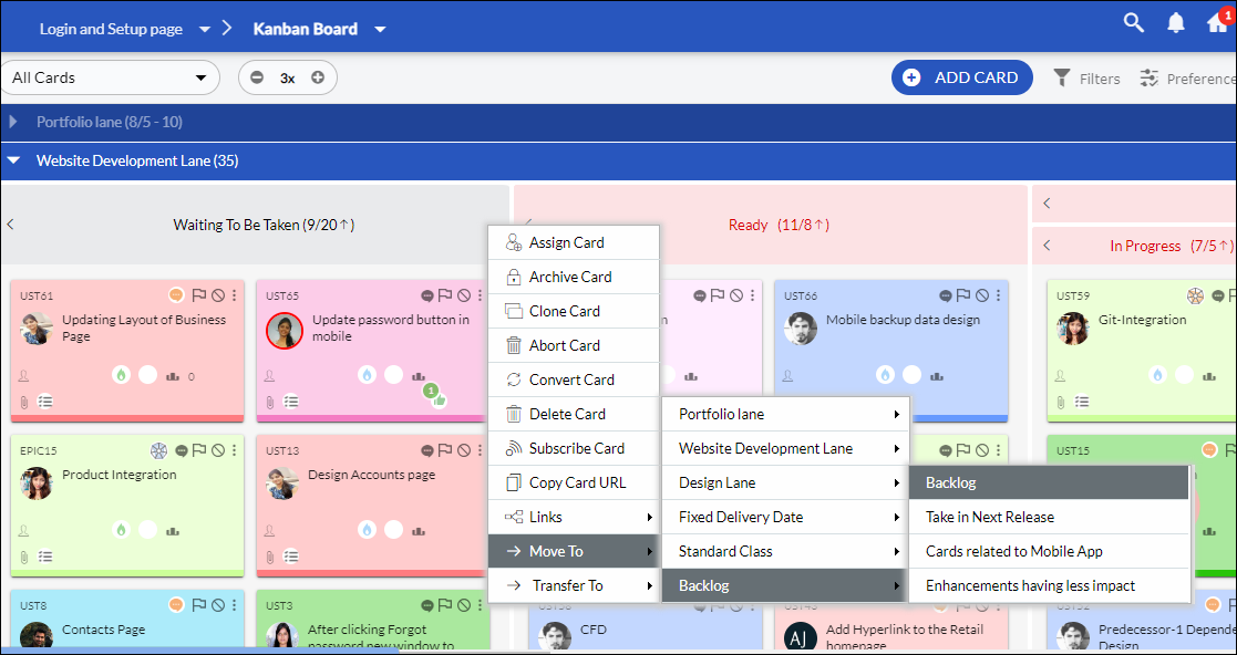
Alternatively, you can click the Options icon, which appears on mouse-over on the card, click Move to from the list, and then select the lane and column.
Similarly, you can move a card to the desired lane and column from the card pop-up. Click the More Options icon and select the Move To option. Then, choose the desired lane and column to move your card.
Note: You will have to add a comment while moving a card if the Make comment entry mandatory on the card movement policy is enabled.
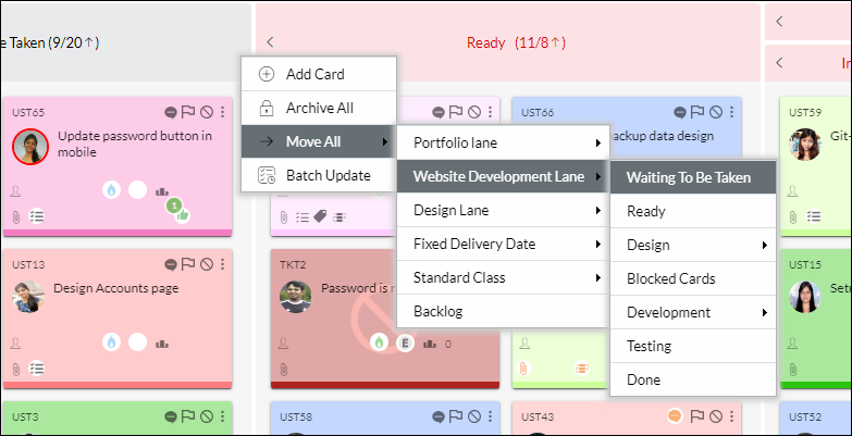
Move All Cards to Another Column: Right-click a Column header and select the Move All’ option on the menu.
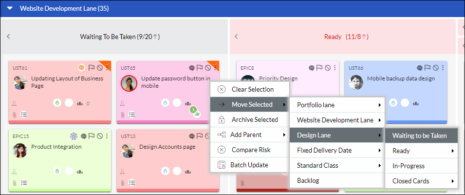
Move Selected Cards to Another Column: You can also select a set of cards using CTRL+ Click and right-click to move selected cards. The selected card is indicated by a yellow checkmark. To unselect when selecting cards, use CTRL + Click on the cards again. The yellow checkmark on the card disappears. Next, right-click on the lane header select the ‘Move Selected’ option, and then the lane and its respective column to where you want to move the cards.
Important Points to remember for moving cards
- You can’t move a card to the “In-Progress” column of a Portfolio lane by drag-drop. It will move to the “In-Progress” column” automatically based on either “Card % Progress” or “Child % Progress” preference. To know more about it in detail, please read this Help page.
- You can’t move a card to a Percent-Progress column, which is generally named the “In-Progress” column by drag-drop. It will move to the “In-Progress” column” automatically based on either the “Card % Progress” or “Child % Progress” attribute set for the card type. To know more about it in detail, please read this Help page.
- If the Board Policy “Restrict column WIP limit violation” is enabled for a Board. You can’t move a card to any column, which has already exceeded the set column WIP limit (maximum WIP limit).
- You can’t move a blocked card. You need to first unblock it to move it further.
- You can’t move a card if you have Reader access on that Board or at the Admin level.
- If you are a Shared Resource on a Board, then you can only move a card, to which you are assigned. You can’t add, modify, delete, or move any other cards on the same Board.
Top
Move a Card to the Backlog
If you want to suspend work on a card, you can move the card to the backlog. Click the Options icon, which appears on mouse-over on the card, and then click Move to Backlog from the list. The earlier analytics will be available when the card is pulled on the board again.
Archive one or more Cards
Archive or close a card when it reaches the last lane on the board to indicate that the work has been delivered. You may even archive a card from its current lane if you decide that the card need not progress through the remaining flow.
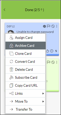
Click the Options icon appearing on hovering over the card. Click the Archive Card icon and the card will no longer be available on the board. However, you can view it from the List View of the Card Type as Archived/Closed. The Current Owner of the card is retained even after Card Archival. This will help you keep track of who was the last User to work on the archived card. Similarly, you can archive cards from the card pop-up view by clicking the More Options and selecting the Archive Card option.
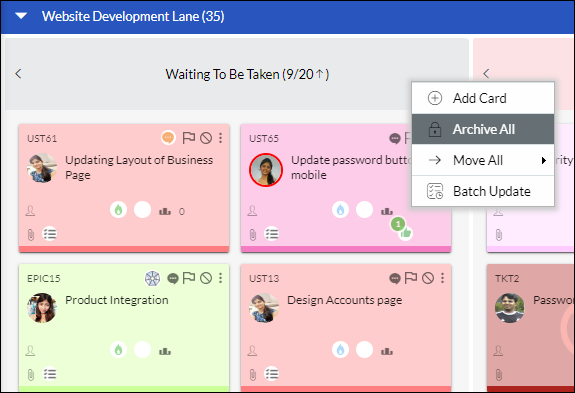
Archive All Cards: Right-click on any lane header to archive all the cards in that lane in a single click.
Note: Any blocked cards in the lane will not be archived.
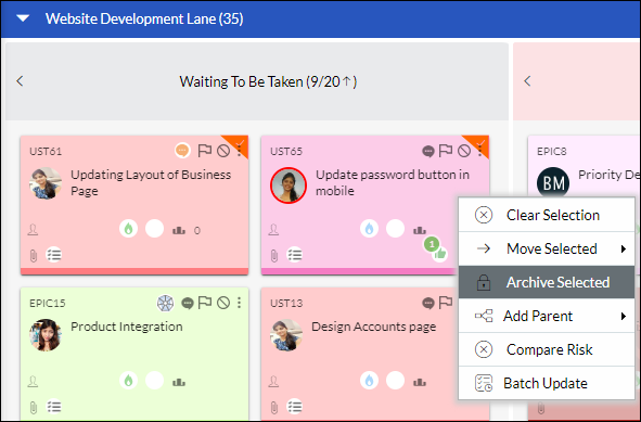
Archive Selected Cards: CTRL(Windows) or COMMAND (Mac) + click the required cards and right-click to use the Archive Selected option. The yellow checkmark appearing on the cards indicates that the cards have been selected. To unselect when selecting cards to archive, click CTRL + click again. The yellow mark disappears from the card.
Note 1: You cannot select any blocked card to archive unless you unblock it.
Note 2: You can archive multiple cards simultaneously that belong to the same column or sub-column only.
View Archived Cards
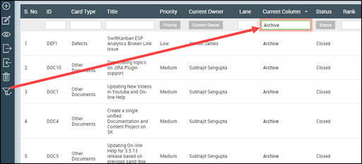
If you would like to see the cards that have been archived, you need to go to the Main menu > Card Listing > All Cards. On the All Cards page, click the Filter icon from the side toolbar, and then enter “Archive” in the filter text box of the Current Column. All the archived cards are displayed.
Transfer the Card to a Different Board
You can transfer a card to another board if it was meant to be there. You do not have to recreate a card if you created it on the wrong board or maybe just a change of decision.
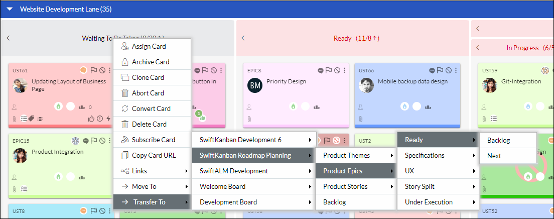
Hover on the card, click the Options icon, and then click the Transfer To option on the menu. After a few seconds, another menu on a different board is displayed. Click the ‘destination’ board and then the Lanes and its column where you want to move the card. A message is displayed after the successful movement of the card. On the destination board, you can see that the card is placed in the selected column.
A few Things to Remember while Transferring A Card
- A card will not be moved if the destination board does not have the card type enabled for the board. To enable the card type, see Enable / Disable Card Type on the Board.
- If the new board doesn’t have the Card Type ( that of the original card) enabled, an alert will be displayed to convert the card to the suitable card type and then move the card.
- When a card is transferred, the following details are inherited and shown on the card:
- The Activity log of the transferred card shows all the activity logs of the cards from the time of card creation along with the information from which board the card was transferred.
- If the destination board has card attribute-enabled Lanes, the Transfer To menu option will display the applicable lanes according to the card attribute.
- When a card is transferred to another board, the original card owner is preserved on the transferred card provided the owner is present on the target board. In case, the card owner is not present on the target board, then the card will be assigned to the user who is transferring the card.
- Similar to the Card Owner, while transferring the card from one Board to another, the To-Do owners are also transferred (provided they are in the target Board) with all details like estimated, actual and remaining effort, and To-Do state. If the To-Do owner is not present on the target board, the same To-Do will be assigned to the person transferring the card.
- Moreover, after the transfer, all the original comments on the card are restored and displayed along with the original timeline of the comment when it gets transferred to another board. If the users who commented on the card in the source board also exist on the target board, the comments on the transferred card will display their names. If not, those comments are tagged to the user who transferred the card. But, in this case, for ease of understanding, the names of the original commenters are also shown in the bracket.
Flag a Card
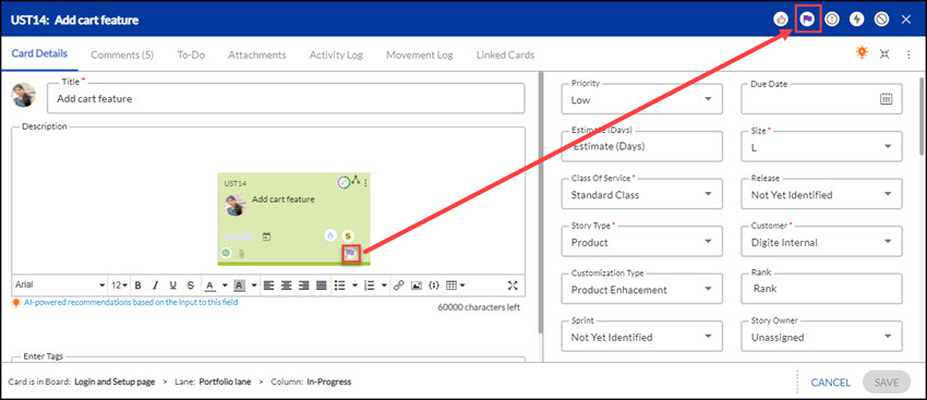
SwiftKanban enables you to flag a card and mark it for different purposes – so that you can highlight different aspects of the card or draw attention to it. Depending on the reason for highlighting, you can select one or more types of flags to highlight the card. You can flag a card or view them both on the card pop-up and carousel view.
To flag a card, mouse over the card. The various available flag types are highlighted on the bottom right of the card. Click the required flag. To remove the flag, click the flag again.
Note: 1. The flags can be configured through the Card Designer at the Admin or Board level.
2. While flagging/unflagging a card, you can mention your teammates in the comment too. To know more, click here.
Change the Current Owner / Assign Multiple Owners
Tips: We have an exciting in-app Learning Enabler, called Challenges that would help you learn and assign users to the card interactively. Please navigate to Help & Support > Challenges from the top-level menu and try out the Challenges.
The card when added may or may not have an owner assigned to it. An unassigned card is indicated by no image in the avatar placeholder and on hovering shows ‘Unassigned’.
To assign an owner or change the current owner:
- Click the placeholder/picture profile on the card. Alternatively, you can right-click the card, click the Assign Card option
- In the Card Assignment window, the current owners’ names, if assigned, appear at the top of the owner list. Click to unselect the current owner and select a new team member from the list.
- Click Submit after you have selected the owners.
If the team member has uploaded his/her avatar, the placeholder is replaced by the image for identification. On hovering over the avatar, the card owner’s name is displayed.
Filter Card Owner List
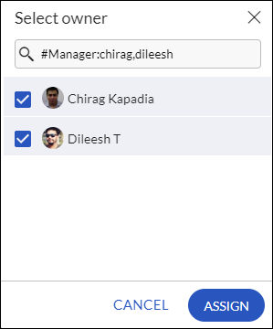
While assigning card owner(s) for a card, you can also filter the users from the list based on their role, name, or a combination of the two.
- To search for a team member by name, enter the search string. As you type, the matching results are displayed. Click the required user name to select.
- To search for a team member by role, enter the role and username in the following format:
#Role: name
- To include multiple names in the search filter, separate names with a comma. Example, #Manager: Dileesh, chirag,
Note: When you pull a card, you are automatically assigned as the card owner. If you do not want this and want to assign the card to the team members you select, you can disable the board policy, ‘Auto-assign cards when pulled’ from the Board Editor. Thus, you can choose the card owners on your own when adding or after you have added a card.
To assign a card to multiple owners, in the Card Assignment window, select multiple owners to a card by clicking the required team members one by one. If you selected multiple owners, the profile picture displays a picture of the first owner and the count of the rest of the owners below it. On hovering, displays the names of the owners. This feature enables team members to add multiple Tasks/To-Dos to the card and assign a To-Do for each of the owners selected. They can report progress (i.e. Pending/In-Progress/Completed and To-Do effort) against the assigned To-Do, which will finally roll up to the card-level progress.
To unassign the current owner, select ‘Unassigned’ from the list. Note that if an owner has not uploaded his/her image, it is indicated by the user’s initials.
Manage To-Dos for a Card
Tips: We have an exciting in-app Learning Enabler, called Challenges that would help you learn and add To-Dos to a card interactively. Please navigate to Help & Support > Challenges from the top-level menu and try out the Challenges.
You can add tasks or To-Dos to a card to break down the work into smaller manageable units. Card Owners can add and manage their own set of To-Dos, estimate effort, and report progress against their To-Dos.
If your product owner has created a predefined To-Do list, you need to just report progress on it. You may still add to the pre-defined To-Do list for a card.
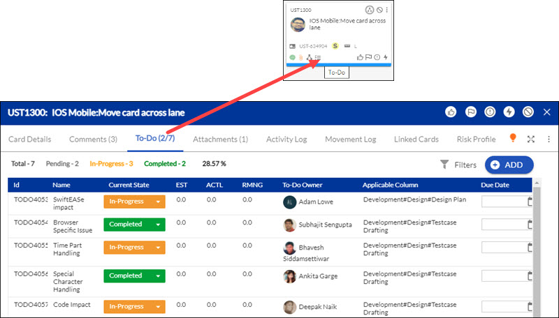
To add To-Dos for a card on the board, click the To-Do icon on the card appearing on mouse-over. You can even click the Card Title and then click the Tasks section.
Note:- If the To-Do icon is disabled. It can be enabled through the Card Designer at the Admin or Board level.
-
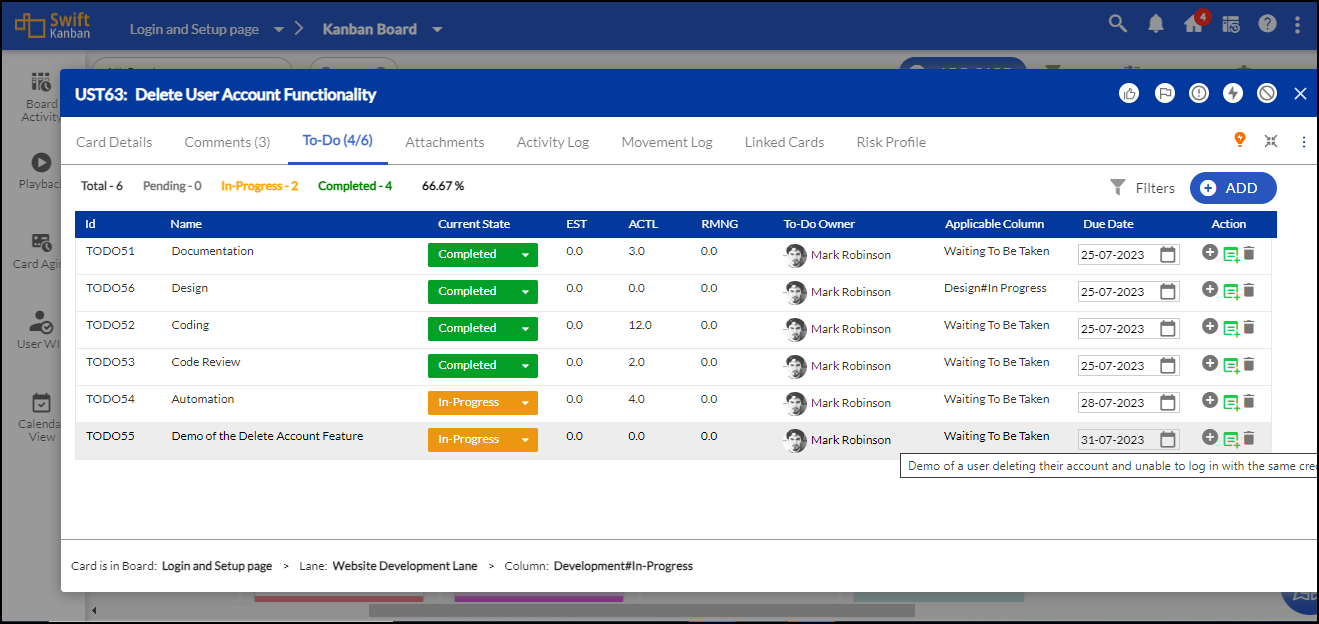
- Click the ADD button on the top. A To-Do row is added below.
- Enter the details for the To-Dos you add.
3. Task/To-do Name: Double-click to type the name to identify the task name and hit ENTER.
4. Applicable Column – The current column of the card is displayed by default. You can select the lane with its respective column on the board for which the task will be applicable.
5. Estimate – Enter the estimate for the To-Do, which will be interpreted as days/hours/story points (as selected in preference for the enterprise). However, if the Time-Tracking Plug-in is enabled for the enterprise, you need to interpret the To-Do Estimate in hours only. The sum of all To-Do Estimates will be shown in the To-Do Estimate for the card. The Estimate (Card) and To-Do Estimate are not interrelated.
6. To-Do Owner – By default, the To-do is assigned to the one who adds it. Click to select the owner for the To-Do from the list of team members. If you want to assign later, select the ’Unassigned’ option from the list.
7. Current State – Until the owner does not update the task to indicate progress, the ‘Current State’ will display as ‘Pending’.
8. Action –
- To add more To-Dos, click the Add icon for the existing To-Do and enter details as described above.
- To add a comprehensive description for every To-Do, Click to Add Description icon. This helps you to provide a clear and detailed explanation of each To-Do, helping you and your team members better understand the purpose, scope, and progress of every To-Do. On hovering over this icon, you can view the To-Do description.
- To remove the To-Do, click the Delete icon for the required To-Do.
Note: If the lane in the Applicable column appears in red, it indicates that the lane is deleted from the workflow/process.
To report the progress of your To-Do, double-click the Current State drop-down list and select, ‘In-Progress’ or ‘Completed’ from the list. The colors gray (Pending) orange (In-Progress), and green (Completed) also indicate the To-Do status. Click here for more help on updating and tracking the To-Dos by status. If you have Time-Tracking Plug-in enabled for your enterprise, you will see the Actual and Remaining columns to update effort (in hours). For effort-based updating and tracking of To-Dos, see the Logging Effort for To-Dos help.
Updates to a card To-Do are logged in the Card Activity Log for tracking task activities such as new To-Do, Assignment of To-Do Owner, etc.
Edit Card Details
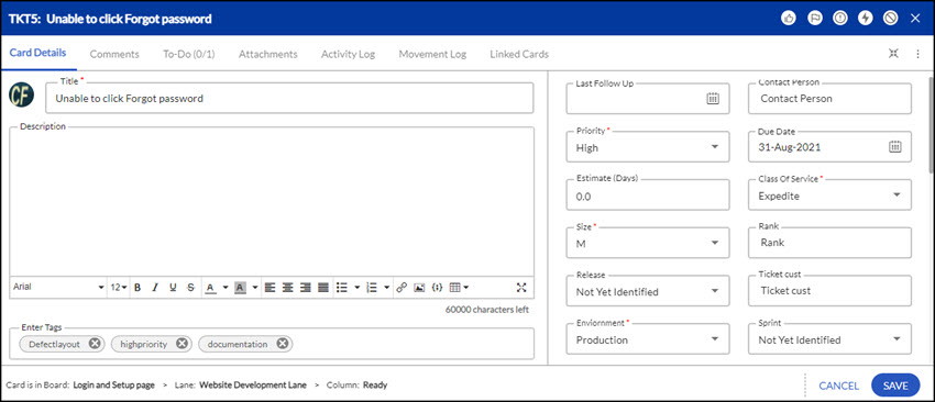
The card details can be viewed and modified on the board by clicking the card title. The Edit Card window displays the Card Details, To-Do, Activity Log, Movement Log, Linked Cards, Comments, and Attachments tabs along with a quick count of these items in the header itself (the To-Do tab will show both the completed and total count). Make your changes in the Details tab. To change the card owner, click the Picture Profile and select new owners or you can select ‘Unassigned’ to un-assign the card. See the Change the Owner/Assign Multiple Owners section for help.

Note that you will not be able to enter an estimate for a card if it is linked as a parent card to its child cards. The value is read-only and is rolled up from its child cards.
- To add and reply to comments, see the Commenting on a Card section.
- To add, update, or delete a To-Do from the card, see Managing Tasks/To-Dos in a Card.
- To add, download, or delete an attachment, see the Managing Card Attachments help page.
Add Code Snippet
Click the Insert Code Snippet icon, select the language, and enter or paste the code. The syntax will be formatted based on the coding language selected by you.
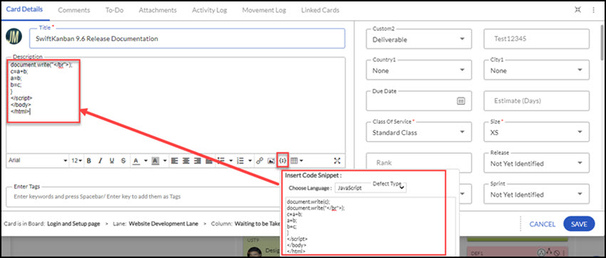
After making changes in the Details tab, click Save in the pop-up.
View /Update Custom Fields in a Card
Tips: We have an exciting in-app Learning Enabler, called Challenges that would help you learn and update the card fields interactively. Please navigate to Help & Support > Challenges from the top-level menu and try out the Challenges.
Your enterprise may want to capture any specific information while adding a card on the Board or Detail view. You need to first add and configure the custom fields in the Card Type through Card Field Editor and then the team members can enter values in the cards. To add and configure fields, see the Help page on Card Field Editor.
While adding the values in the ADD CARD or EDIT CARD pop-up on the board, the custom fields are placed in rows below the Enter Keywords text box in the order they are added in the card type layout in the Card Field Editor.
By default, the custom fields are displayed partially. To view and enter values for the full set of custom fields, click the slider icon, as shown in the image below. It then resizes the description and keywords accordingly and shows all the attributes in rows.
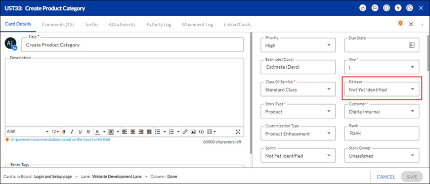
If you have the Release plug-in enabled, the Release attribute/field will appear automatically, so that you can tag a card quickly to a release. However, you will not be able to view and edit the Sprint with which it is associated. (The Add/Edit Card pop-up does not display Read-only attributes.) Similarly, in the Detail view, you can edit the Release and you can view the associated sprint, but not edit it. In the Detail view, the custom fields are listed below the current owner.
Clone/Duplicate a Card
You may want to create a replica of an existing card without going through the hassles of creating a new card and entering all the details from scratch. You can create a copy of the card and then make the required changes to the new one.
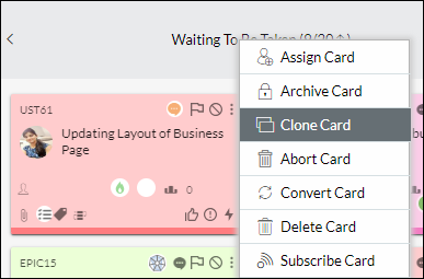
To clone a card, click the Options icon on the card you want to clone and then click Clone Card. On confirmation, a new card is created in the same lane with the copied title prefixed with ‘Clone of’.
- All the card attributes are copied to the new card along with the To-Dos and attachments.
- General Comments and Comments added when blocking and unblocking the card will not get copied to the new card as the card will be updated independently as work progresses.
- If the card hierarchy feature is enabled, the cloned card also gets linked automatically to the older card, retaining the source link.
- A blocked card cannot be cloned, unblock the card, and then you can clone the card.
Abort Card
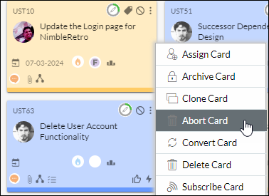
You can drop a card from the Kanban Board at any time. To abort a card using the card sticky, click the Options icon on the card you wish to drop and then select Abort Card. Similarly, you can choose a card you want to abort and select the Abort Card option from the Options in the card popup.
Convert Card / Change Card Type
You can change the ‘Card Type’ of a card and carry over its details to the converted card, using the ‘Convert Card’ option on the card.
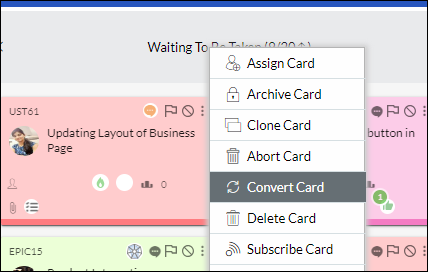
To convert the card, click the Settings icon appearing on mouse-over, and then click Convert Card from the menu.
Select the new card type from the list and click Convert. You can see that the card has changed to the selected card type, copying the details to the common attributes in both card types.
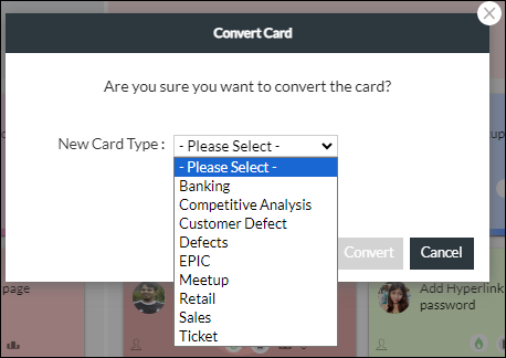
Note: The flags, To-Dos, comments, and attachments are also transferred to the new card except the Activity Logs, Date/Time Stamp, and Vote flag (as it was cast for that particular type of card).
Delete a Card
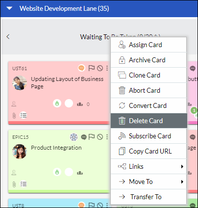
To delete a card permanently, click the Options icon appearing on mouse-over, Next, click Delete Card from the menu. On confirmation, the card will be deleted permanently from the board. You cannot delete blocked cards; unblock the card and delete it. Users with the ‘Manager’ role can delete the cards only. Similarly, you can delete an open card from the card pop-up view. In the card pop-up view, click the More Options icon and select Delete Card. The card will be no longer available on the Board.
Note: If the “Allow Deletion of Card to Admin Only” policy is enabled, only Admin can delete the cards, not even the Manager.
Bulk Delete Cards
To delete multiple cards permanently, go to the List view of the card type, for example, Main Menu>> Card Listing >> User Stories. Hold down the CTRL key select multiple cards, and then click the Delete icon on the toolbar.
Users with the ‘Manager’ role can delete the cards only.
Track Card Activity Log
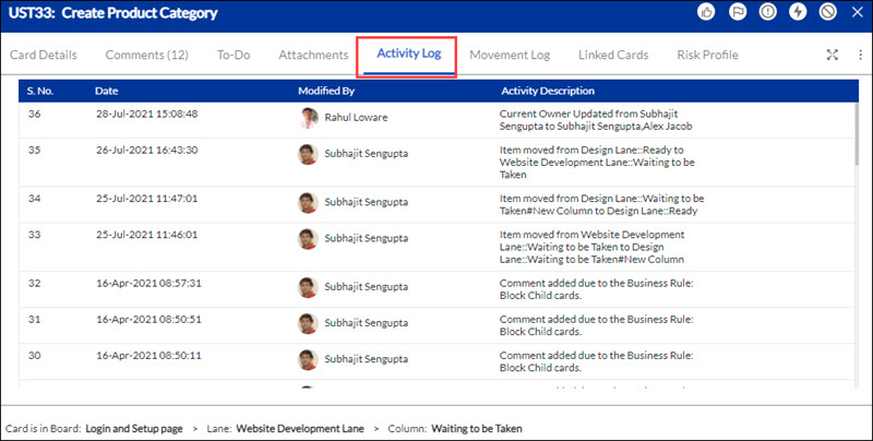
The updates to the card details and card movements can be tracked in the Activity log. Click the Card Title on the card and then click the Activity Log tab in the Edit Card view. The log is listed in descending chronological order of Date and Timestamp. The log includes card updates such as the Current Owner updated, comments added, the card moved from one column to another, and events such as blocking the card, updating a ToDo, and attaching a file. It also shows who performed the card activity.
Track Card Movement History and Analytics
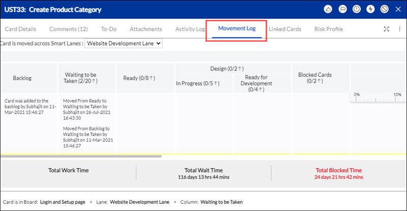
To track the history of a card movement through the flow, click the card title and then the Movement Log tab in the Edit view. The layout resembles the board layout and gives details in a particular lane i.e. from which lane the card has been moved to that lane, the team member who moved the card, and the timestamp when it entered the lane. If you scroll vertically, you can view the Work Time, Wait Time, and Blocked Time of that lane. You can scroll horizontally to view all lanes. The log also displays the Total Work Time, Wait Time, and Blocked Time of the card in the footer.
- Notes:
If you have enabled Lanes and moved the card across lanes, you can choose to view the history for any of the lanes by selecting the lane. - If the “Select the days that you want to consider as holiday(s)” Board policy is enabled, the days marked as holidays will be excluded from the Movement Log of a card. These days will not be counted when tracking the card’s movement across columns, ensuring that only working days are considered in duration calculations. Work Time, Wait Time, and Block Time calculations will show durations based on the preference selected at present.
View Card Links/Card Hierarchy
The Hierarchy icon appears on the cards that belong to a hierarchy or that are linked to other cards. Click on it to directly go to the Linked Card Hierarchy View. See detailed help on Creating links between cards and parent-child hierarchy.
Copy Card URL
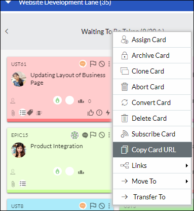
You can copy a card’s URL by directly opening it in the browser, or share it with others. To copy a card’s URL, click the Options icon on the card, and select Copy Card URL from the menu. Opening the link will flash the card on the board, provided the user has access to the board.
Subscribe Card
You may want to receive notifications for a card on various events occurring such as if a user blocks the card, adds a comment, or the due date gets changed, etc. that requires your immediate action. SwiftKanban displays a message to notify the occurrence of an event on your subscribed card. This is crucial, especially, when you have a distributed team, working across different time zones.
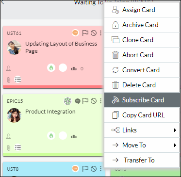
To subscribe to a card, click the Options icon on the card, and select Subscribe Card from the menu. A message flashes on the board stating “Card subscribed successfully”. Similarly, click the Options icon on the card, and select Unsubscribe Card from the menu to unsubscribe from a card.
View the Unique Business ID of a Card
To ensure that a card is unique across the account, SwiftKanban has a read-only attribute named “Unique Business ID” for all cards. This unique business ID is a combination of a unique numeric ID prefixed with the Short Code assigned to a card type.
Select the attribute from your Card Designer and this attribute will be available on your card pop-up.
For example, for a User Story card UST33, the Unique Business ID attribute is UST-639438, which is a combination of the shortcode of the User Story card type (UST) and prefixed with a system-generated unique numeric ID.
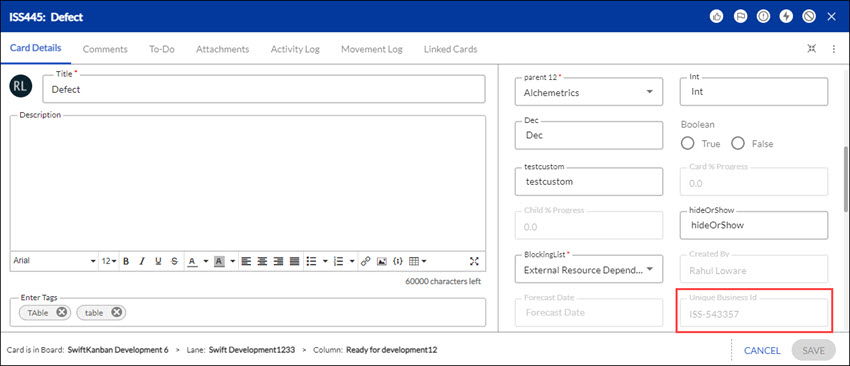
Once generated, the Unique Business ID of a card remains unchanged even if the card is converted from one card type to another card type. For example, if the User Story (with its Unique Business ID UST-639438) is later converted into a Defect), then the Unique Business ID of the converted Defect will remain the same as earlier i.e. UST-639438.
You can even search a card by entering the search string Unique Business Id followed by a colon and adding the Unique Business Id in the ‘Search ‘ box available in the top-right corner of the application.

If there is no card with a matching Id, the message, ”No results found” is displayed, click the Search Globally link to search on other boards. If there are matching cards, they are listed for each board. Click the required card from the list to view its details.
This attribute is available in the Card pop-up, Card Designer, Card Listing, on the Export Card option, and All Cards listing screen.
View Card Type % progress of a card
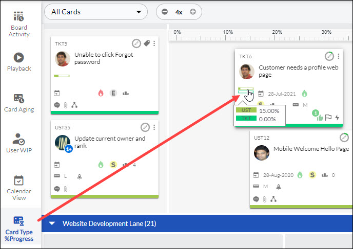
In SwiftKanban, a card may have multiple child cards of different card types. The overall progress of the parent card is calculated based on the progress of its child cards. To see the Card Type wise % progress of child cards on the parent cards, one has to turn on the Show CardType-Wise Progress on Parent Card admin policy. If this policy is ON then the Card Type % Progress icon is shown on the bottom of the left toolbar on the Kanban Board. On clicking the icon, the card type-wise progress of child cards can be seen on the parent cards on the Kanban Board.
View All Cards or My Cards/ToDos
On the top menu bar, you have two options:
- All Cards: To view all the cards on your Board
- My Cards/ToDos: To view the cards on which you are set as a card owner or a ToDo is assigned against your name.
Refresh the Board
Sometimes, you may have your Kanban board on your desktop but may not be performing any activity. However, your teammates may have made some updates such as pulling a card, adding a comment, or even blocking a card. The SwiftKanban Board is refreshed by default and shows the changes immediately after they are made.
The cards modified on the board are highlighted if there are any changes made to the card attributes in the Add Card pop-up. The count on the Notification or inbox icon increments automatically on the control panel, which lists the cards in the Notification widget for specific board events. These are very important visual indicators for a distributed team to be in sync so that they don’t miss out on critical events.
The card sizing view set, Lane Width adjusted, Fit to Screen, and cards resequenced persist on Board Refresh and across login sessions.
View the Activity Log for the Kanban Board
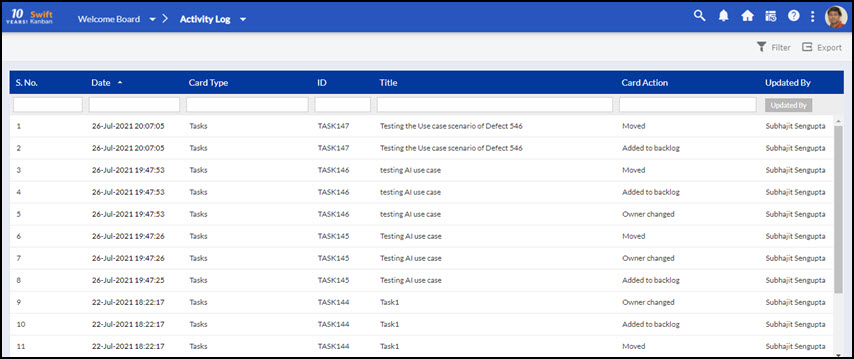
Track the board activities such as cards added and moved, the owner changed, WIP limit violated, card blocked, etc. by clicking the Activity Log icon on the main menu bar.
For every action on a card, the log displays the card ID, Card Type (User Story, Defect, or Issue), Name of the Card, Card Action (Movement, Blocked, Unblocked, etc.), and other details of the action.
For offline analysis of the board activities, export the Activity Log by clicking the Export icon in the Activity Log view. The entire log file is exported by default, which is in CSV format. Enter the file name and click Submit.
You may want to view and export specific activities, for example, updates made by a particular person to User Stories. Click the Filter icon on the top menu bar, and filter the log by selecting/entering the values in the Filter boxes. When exporting, select ‘Export only filtered Items’ in the Export Options list and export.
Apply Filters to View Specific Cards
With too many cards on the board, it’s difficult to prioritize work. You can use the Board Filter option on the Side toolbar to view only selected cards based on Priority, Card Type, Size, Team members, Card Aging Cycle Time Threshold, etc.

Click any attribute on the left pane of the Filter window, for example, Card Type, and select any attribute value such as User Stories, Defects, and so on from the available List and click APPLY.
To filter cards based on the Team Member attribute, first select the Team Member option from the left pane. Then, choose the corresponding value from the right pane to narrow down the results.
Additionally, if a card has no team member assigned, select the Unassigned value to view all such cards that do not have an assigned team member.
You can also filter cards based on Rank by entering Rank values such as Rank >= 4 and Rank <= 8. It will display only the cards within that range which helps you to focus on high-priority or important cards by specifying a Rank range. 
You can also search the desired attribute value using the Search in Available List box. You can apply filters for custom and custom common fields on the Kanban Board and Backlog Board.
The cards matching the selected attribute value will stay on the Board and other cards can be hidden from the Board until you remove the filter. Thus, the Priority, Class of Service, and Size attributes associated with a card can be used to filter cards to narrow down your focus on the progress of specific cards.
You can also customize the filter by selecting the “OR” or “AND” condition checkbox
Example: Filtering with AND condition for team member A and Release R1, displays cards only with team member A and release R1. However, filtering with OR condition displays cards with team member A or releases R1 or both.
You can also reverse the selection by selecting the Enable Negative Filter option.
Note: Whatever attribute value you select on the Filter page will exist only in the current sessions until you log out from the application. For Example, if you apply a filter navigate to another board, and then come back to the same board, the filter persists, but if you log out from the application, the filter gets cleared.
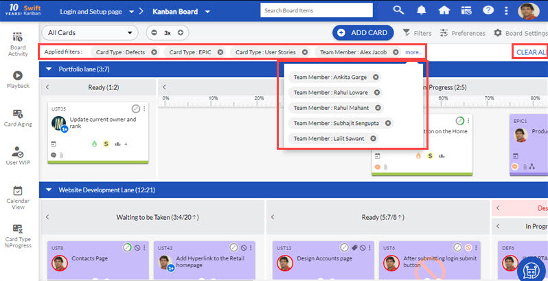
Once you have applied the filter, the filter criteria are visible at the top of the first lane on the Board. For your ease, if you want to delete any of the filter criteria you can click the close button present beside each filter criteria. If you want to clear the entire filter criteria, you can click CLEAR ALL.
You can save your filter preferences with a unique, custom name of your choice, and apply it every time you want to use the same filter preferences.
To save a filter, after you select the desired attribute values, click Create New Filter enter a unique name in the Filter By field, and click the SAVE button.
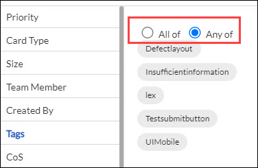
Note: While filtering cards based on the tags, you can apply additional conditions to specify whether you want to see the cards having all the tags or the cards having any of the tags.
With the Parent Card option, you can filter and view child cards on the Kanban board. You can either view All cards related to a specific parent card or narrow down your view to Immediate cards within a particular card type.
Additionally, you can easily track the progress of child cards across multiple projects at a glance. All the Immediate child cards, for all the selected parent cards are visible on the Kanban Board.
Publish Filter to the Users
As a Manager, after you create a filter and save it with a unique name, you can share that filter with your team members. When you share that filter with other resources, it will, by default, be applied to their Board and they will be able to see those cards that match the applied filter criteria.
To share the filter with other members, after you save it, click PUBLISH TO, select the resources with whom you want to share the filter from the Publish Filter To list, and click PUBLISH.
Note: The PUBLISH TO link only appears when you either are creating a filter or have selected a saved filter available in the Filter By field.
Note: Only the users with the Manager role have the access to publish filter.
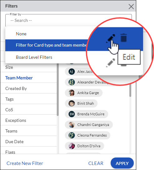
You can also edit, rename, delete, or make a copy of an existing filter by selecting the existing filter available in the Filter By field, and then selecting Edit or Delete. For example, to rename an existing filter, open the list of saved filters under the Filter By field, hover over the filter that you want to edit or delete, and select the required operation that is available against the filter name. Once you are done with your required operations, you can click SAVE. If in case, you don’t want to make any changes click CLEAR.
Exceptions filter: When you’re working with a large team, the focus of executives/managers is typically on any exceptions/blockers that might impact any deliverable and require their intervention. Even though ‘Blocked’ cards are highlighted prominently, there might be exceptions that need focus. So you can select the ‘Exception’ filter on the board to view cards that are:-
- Blocked: – Cards that are blocked on the board and need attention.
- Unassigned: – Cards that are still waiting to be pulled or yet to be assigned to any team member.
- Overdue: – Cards that have already crossed the ‘Due date’ set for the card.
- Off-Estimates: -Cards that have already taken longer than the estimates defined.
Teams Filter: Using the filter, you can view only those cards assigned to the team members associated with the team you select in the Filter. The Team is defined at the enterprise level where users are selected to be part of a team and the Team list displays these in the filter, provided any of the members from the team are assigned to your board. For example, if there are 15 teams at the enterprise level and members from only 4-5 teams have been invited to this board, only those teams will be displayed in the Filter list. If the team members are removed or added to the team and these members are/were assigned to your board, the cards will be displayed with effect to the new team. Read more on Defining Teams.
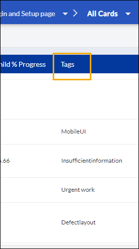
Filter Board by Tags: Filter Board on tags to enable focusing on cards related by way of a common theme, task, feature, etc. Ensure that you have added related tags to focus on specific cards. To filter cards as per tags, click the Main menu and navigate to Card Listing >> All Cards. Enter the tag in the filter of the Tags column.
Release Filter
For the Release & Sprint attribute, you can select the whole release or specific sprint under a release to retrieve the matching cards. To remove the filter, in the Filter window, click CLEAR.
Filter by Cycle Time Threshold
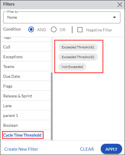
You can also filter cards based on the cycle time threshold that you’ve set for the particular columns. There are three set criteria for the Cycle Time Threshold filter:
- Exceeded Threshold 1: Any cards that exceed Threshold 1 but remain inside the range of Threshold 1.
- Exceeded Threshold 2: Any cards that exceed Threshold 2.
- Not Exceeded: Any cards that are inside the range of Threshold 1.
Preferences
To view the cards or your Board either in a sorted format or if you want to highlight some cards that are critical or as per the team member on the Board, you can use the Preferences menu.
Sort Board Cards
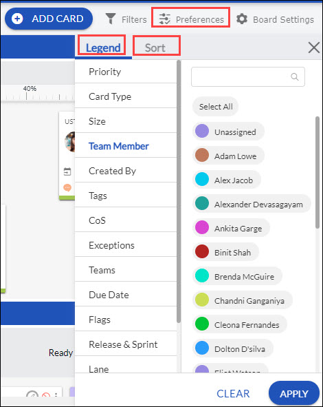
To sort cards as per an attribute of the card, select the Preferences menu from the top menu bar and select the tab Sort. Next, select an attribute from the Sort By drop-down. Click Apply to implement the sorting preference.
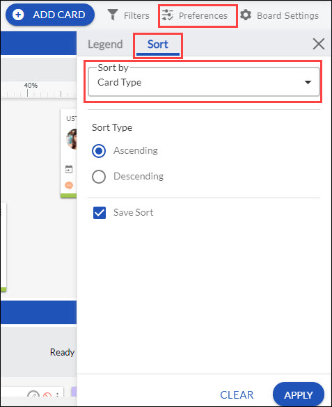
You can decide to sort the cards in ascending or descending order by selecting the appropriate Sort Type radio option. To save the sort preferences for the next login, select the Save Sort option. Note: On the ToDo Board, you can sort the cards on your Board in ascending or descending order based on the Name of your cards.
Highlight Cards using Legend
You can use the Legend option in SwiftKanban to highlight cards based on the selected attribute’s values. The Legend highlights the cards of the selected Attribute’s Values and helps you analyze how many cards of the selection area are on the board.
Click the Legend tab under the Preferences option on the top menu bar, select the required card attribute, and then select its values. The cards of the selected values are highlighted on the board.
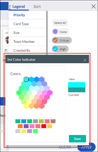
You can also select the color in which the value would be highlighted by double-clicking the small color box beside the Attribute’s value and selecting your choice of color through the color pallet as shown below. Moreover, you can also view the existing color applied to the attribute value and the new color that you have selected.
To, apply the chosen color to the attribute value, click Save.
To remove the highlight or roll back to the original colors, click CLEAR.
Note: The color-picker doesn’t work for Card types as their colors are set at the admin level.
You can change the attribute, by directly clicking other attributes and their value.
Display Media on Card
You can set an attached image as the cover image for your card on the Kanban Board. Choose an attachment and use the Set as cover image option to set the attachment as the cover image of the card. Then, navigate to the Media on Card tab in Preferences, and enable the Display Media on Card toggle. With that, the cover images of the respective cards on the Kanban Board will be displayed.
Tag your Cards
A card can be identified from the many fields, and tags are one such field that can be used to sort the cards. Tagging can be a great way to associate cards with a release, sub-tasks to a story, feature, board, etc. You can ‘tag’ a card with any value/label you want or as many as you want to retrieve the card specifically during the search or board filtering on tags.
We have an incredibly diverse set of customers, so we have added it as a preference so you can enable tagging only if your enterprise needs it. If you have not enabled the preference, you will not be able to see the Tag icon.
To add a tag, while adding a card, type text in the free-flowing text box next to the Tag icon and press ENTER or SPACEBAR. The tag appears along with a cross mark. It is much easier to select the required tag from the Auto-complete list. The tags already created for cards on the board are listed as you type.
To delete the tag, click the cross mark when the cursor turns into a hand pointer. You cannot edit a tag, it’s quick to delete and add a new tag instead.
If you type a duplicate tag in the same card and try to press ENTER, it will not be accepted and will highlight (in yellow color) the existing tag in the text box.
Save the card after you add your tags. Hover over the Tag icon, and the tags are displayed so you know quickly what tags are added for a card. You will see the Tag icon hovering over a card only if you have added tags to it.
Note: Words used as a single Tag cannot have space in them. If you give space between two words while adding them as one tag, then they will be considered as two separate tags (the first tag is the word before the space and the second tag is the word after the space). So, it is suggested that you add a hyphen (-) or underscore (_) or don’t keep the space to be considered as one tag. However, when importing cards from Excel into SwiftKanban, a tag having two or more words with space will be considered as one tag.
Note: Ensure you have enabled the tag feature by navigating to Admin Settings >> Admin Policy page and selecting the enable Card Tags option.
Resize Columns
You can resize the columns on your Kanban board and make any column wider/narrower using the drag-drop slider. The slider is displayed when you hover on the column borders. It is a useful feature to adjust the board layout based on the volume of cards in various columns.
When you have two cards in a column increase the width that there will be two stacks. If you have four cards and you increase the width, there will be two stacks with two cards horizontally placed next to each other. If you decrease the width, there will be four stacks. and the cards will move below each other.
The column width set persists on Board Refresh and across login sessions.
The below screenshot shows how a column with two stacks can be expanded, which will then have three vertical stacks with cards distributed in these columns.
Expand and Collapse Lanes
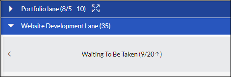
With multiple Lanes, it may be cumbersome to scroll up and down to configure and view lanes. You may expand the lane later by clicking the Expand Lane icon i.e. the right-pointing arrow on the left of the Lane header to view the entire workflow. You can click the Collapse Lane icon i.e. the downward pointing arrow on the left of the Lane header to collapse other Lanes while you work on the required Lane.
Expand/Collapse state of the Lanes that you have set persists across sessions.
Expand and Collapse Columns
You can collapse and expand the parent column and even the child if these are vertically split within a lane. This allows you to hide unnecessary sections on your board and lets you focus your view on a specific section. The capability has immense value for very large boards reducing scrolling.
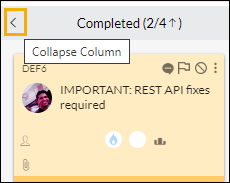
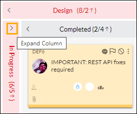
To collapse a column, hover towards the right of the lane header and click the Collapse Column icon. The column will be docked vertically on the left of the next column, as seen for the Ready column in the below image. On collapsing, the Expand column icon is seen which can be clicked to expand the column back.
If a Column is vertically split, each of the child columns can be collapsed. However, you cannot collapse the horizontally-split child lanes. As seen in the above image, you can see that the Collapse Column icons are available for both, ‘In-Progress’ and ‘Done’ columns in the ‘Develop’ parent column.‘
Read-only view of the Kanban board
A Kanban board can be projected as an information radiator on large screens that are commonly accessible to the whole team. Stakeholders who do not contribute to the board but want to track the Board can be assigned the ‘Reader’ role on the board.
The team members who are assigned the Reader role on the board, can log in and view the board and even add comments in the Board Profile but cannot add cards or modify the process. The board gets refreshed automatically after every 10 minutes when it is in the read-only mode. In this way, you can continue to be logged in and view updates in real time.
Other features such as Board Filter, Legend, etc. are available for tracking the work progress.
Resize / Reposition Card Pop-up
Sometimes, you may want to adjust the size of the card when adding or updating the details, for example, entering the description or viewing an entire thread in the Comments & Attachments tab. To resize, you can expand the Card pop-up for full viewing by dragging the right corner of the card outward. You can reduce the card size up to its original size by dragging the corner inward.
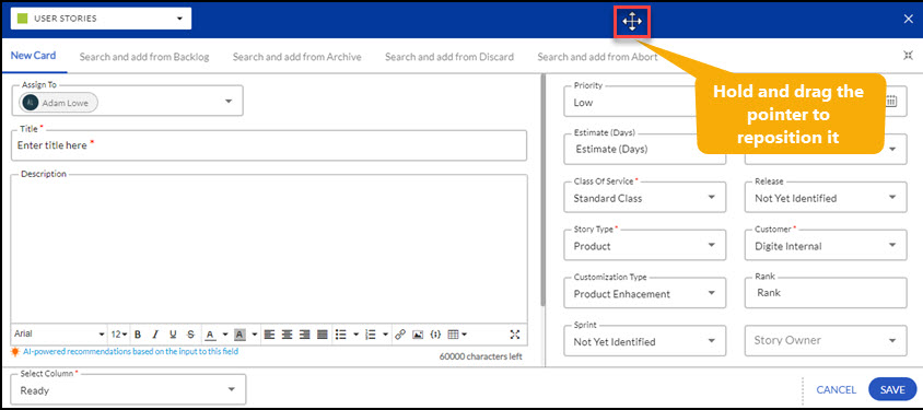
When the card pop-up opens with the Kanban Board in the backdrop, you may want to reposition the pop-up to view a particular section of the board. You can drag the card by holding onto the four-headed pointer that appears on hovering over any of the tabs. Release the pointer when you have dragged it to a suitable place.
Zoom In and Zoom Out the Board
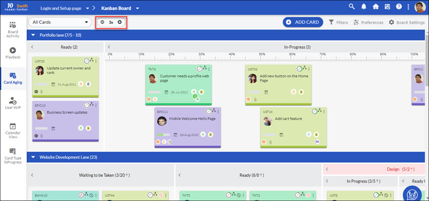
SwiftKanban provides four zoom levels to choose to view more or fewer cards that are, to the required level of card details. Click the Zoom button on the top menu bar to view Very Small, Small, Medium, Large, or Detailed sized cards.
You can make the best use of the different card size views, which persist across sessions.
- Detailed: First Level displays maximum card details with two-row card attributes at the bottom of the card. Card flagging activities can be performed by hovering over the card and clicking the respective icon.
Note: By default, this zoom level is disabled. To enable this, using admin credentials click the Board Settings and click the card designer tile. On the Configure Card View, under Footer select the Two Row option. - Large: The second level displays maximum card details similar to level 1 but has single-row card attributes.
- Medium: The third level displays card ID, card title, avatar, and top-level icons. It enables performing card activities.
- Small: The fourth level displays very small colorful blacks as per the card type.
When you have set the Small and Very Small card size views, double-click the Card Size slider to fit the board to the screen i.e. edge-to-edge. This is applicable when there is space on the right of the board.
When discussing a card in the first three card size views, you can still view the card details. Hover over the card to view a larger view with all the details of the card in focus.
Add Comments or Reply to Comments on the Card
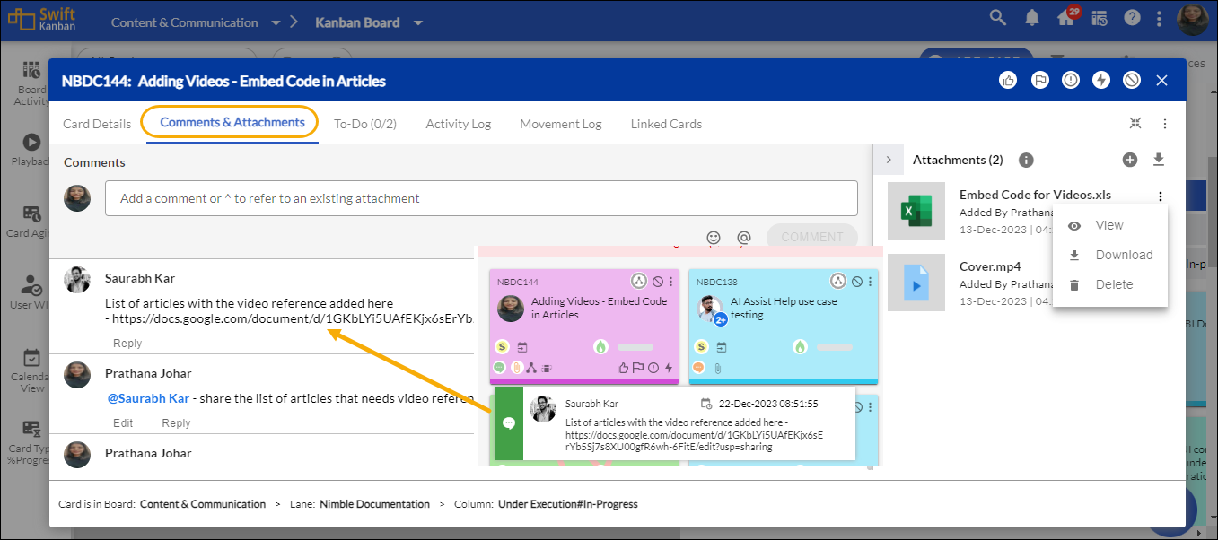
Collaborate with your team to work on a card right on the board. To add comments to a card, click the Comments icon appearing on the mouse-over on the card. In the Comments & Attachments tab, enter your comments as long as 12000 characters. As you type, the remaining characters are shown below the text box. Click Save.
To reply to a particular comment, click the Reply button for the comment. The Comments section displays the date, time, etc. so you can view and track the comments. Click the link for example, ‘has 2 replies’ to view the replies to a particular comment. Whether you add your comments from the Kanban Board or the Detail view of a card, you can track the comments for the card.
The latest comments added to the card will be shown when you hover on the card, displaying the member who commented and the date and time when commented.
